The Wickwillow Tarot formerly the Stained Glass tarot

Mallah

First off I have to say that I’m a HUGE fan of the God Tarot and find the book and take on the cards to be hugely unique in the landscape of tarot. I want to start off saying that I by no means consider myself an artist and have huge respect for those that are and so no offense is meant. Also if any of what I question is an artistic choice just ignore my ramblings.

This deck has not quite grabbed be yet. I like the idea, as I do stained glass as a hobby, and I have several decks that are done in that style.

The use of the lead line look is a bit uneven. It looks like, especially on cards such as The Fool and Empress, that the lines are an after thought. When taking a class we were taught to do all we can to use the lead lines as part of the image. They should flow with the art not against it. When planning out a piece to make it was how to use as few pieces of glass as possible to get the effect. The Empress, to me, came across as if the image was done then the lines were put in when it was done. I almost feel that the “leading” should flow up and down with the trunk of the tree rather then break it apart. But in the Magician, Emperor and Lovers they go amazing with the image.

May I ask what medium you are using to make the images? When I think of stained glass the colors are rich and saturated. The Magician is wonderful in both the line work and use of color. It LOOKS like a glass window, but several of the other cards look rather pale in the use of color. In glass making whenever you change color then you need to change glass. Unless it is a patterned glass or detail work is done as a relief in the glass to really be seen when light is shining through it. If these were richer in tone I bet they would look great as a transparent deck.

Just small details that, again my be artistic choices, I see that throw me off. The detailing on the harp is outstanding, but it draws me to the hands of the Empress which almost look like claws. Some of the facial features look a bit..well..off center. Everyone has their own artistic style so this may be just rambling now.

I like the concepts of the cards and think there is something to be had there, and I do watch the thread.


THANK YOU for your input...as I was telling Gregory, I think the Empress is going to be re done, and i have the same feeling about it....as a matter of fact, you are correct...the lines were added later, as an experiment, to keep me from having to re do the image. Part of what happened when i started the deck last spring was that i got away rather quickly from the desire to do it as a "stained glass" tarot...and yet I liked the idea that I had with the empress so much I thought i'd try it to see if I could pull it off. It only worked in some parts of the image. The Storyteller/Hierophant is even worse. I like the concept I've come up with (Storyteller instead of Bishop/Pope) but this image, too, was "adapted" to the SG look. The fire part of the picture worked well. And i like the idea of trees in the back being the lead lines... but how to do the "darkness" back there and still have it come out that there is light coming thru the glass is a challenge. Ultimately both the Hierophant and the Empress will be re-done...I put them out to illustrate the symbolism I want to use...

ANd the Fool....I think he's going to have to be re done as well...just to bring him up to spec...I've gotten so much better at doing the glassy look since I did him...but the image will probalby remain the same...probably use the same line drawing and just color him again.

As for media, I'm using colored pencil. And sharpies. I know I could probably get a better look with some other media, but the time it will take to master new media (not being an "artist") not to mention the space (I have a 16x24 inch square of desk to work on...and no money to invest in paints brushes, etc etc....). I've used Prismas for years, and did my first deck with them. I'm getting pretty advanced in my blending and underlayment techniques.... Maybe one day I'll branch into other media, but i'll have to have a lot more space available to me than I currently have!

Again thanks for the input. I'll look specifically at what you said about the direction of the lead lines and frequency of them...and i think what you said about the glass..."when you change the color you need to change glass"...I think that means that glasses of different colors would have different textures? I'll consider that as well as I proceed.

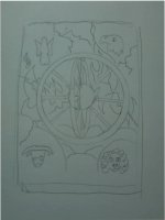
What do you think about the lead lines in my "hermit?" there are some that cross over him...contrary to direction...but i sort of like how they show "vortexes" swirling around him a bit.
 

Mallah

Lesley Ash is a British actress who had some rather disastrous collagen lip injections that left her - well, I am sorry to say - looking a little deformed in that area, She sued. A LOT ! She also got some kind of post op complications and almost died - but it is the lip look that is so - extreme...

Gregory...one of the reasons I'm sort of exaggerating features is so they READ when they get down to poker size cards...the eylashes...the eyes are big, the lips, when i do them at all (note the priestess does not have them...) I don't want to lose those details...and i try shrinking the image to see what "reads". LOL Janice has big lips too!
 

Attachments

  • Janice.jpg
    Janice.jpg
    23.6 KB · Views: 117

gregory

:bugeyed:

OK. Point taken.... The poor thing looks a lot like Lesley !
 

Mallah

NOT that i modelled my empress on Janice! She just reminds me....
 

Babalon Jones

Mallah where is Justice? I didn't see her...

You know, colored pencils on Matte Duralar work really well and could give a stained glass look, and you wouldn't need to buy different materials except the Duralar. A clear colored pencil blender helps too, if you don't have one they are cheap.

A plus with the Duralar is that it is translucent - so you can color BOTH sides of the image if you want to make the color darker or richer or layer colors, a neat effect. If you want, I can mail you a piece to sample so you can see if you like it before committing to buying a pad of it.
 

Mallah

BJ

Got Justice posted; I don't know where she went. She's there now.

I use blenders like they are going out of style! Also will frequently do a white layer underneath, or a blender layer, depending on how effaced i want the color. That sort of "slicks up" the surface and helps the colors schmear when I blend them.

Duralar...is that like drafting mylar? I'm familiar with it, never thought to use colored pencil on it. Unfortunately there's no room in my budget right now even for that. i have been unemployed for 3 years....and have not had a PENNY for going on 3 months. Such is life. The art work is helping me to stay sane at this point. Even bristol is out of my range. I have one sketchbook, and hopefully will have some income before it's used up.

Dem's da breaks.

I look forward to working in other media, but I'm learning just how much can be milked out of very little....(hell the cavemen had roots and berries, and they found a way!)
 

Mallah

Ok, as I mentioned, with the posting of "the hermit" that sort of brings us up current to where I'm actually designing: The Wheel. I have a complete design for strength, tho, and one for the Moon, both of which have to be worked on.

I cannot begin to express the grief this Wheel card has given me, especially in choosing the imagery to include on the card. It's always been one of the more enigmatic cards for me, and I think I can remember having similar problems 20 years ago when I first did one.

There are so many traditions surrounding the wheel, and so many meanings ascribed to it. (there are with the other cards too. but this one, it seems to me, is particulary...rich...shall we say, in it's accumulation of meanings and beliefs.

In asking well what does it mean to ME, I had to say that ALL of the things i know of fill up the "meanings" folder for the Wheel. That's why I've been so confused about what to show and what to leave off.

So I went so far as to look at the books...what do OTHER tarotists mainly think...and got just as many different takes...tho it seems like they all LIMIT theirs down somewhat in readings...lots of folks, for example say it's about good luck, a turn in the tides to good fortune. Period. Well, that certainly makes it an easier card to read. Not so for me, however...but I WILL consider limiting my associated meanings for this card.

Then i went to see all the ways that the wheel has been depicted in Tarot cards...and you know what? I pretty much thought ALL of the cards were sort of...ugly. They are all crammed with esoteric symbols and occult imagery. I found very few i actuallly liked. And yet, I know that by contemplating such cards (as I myelf have done over the years) you come to understand them and grow. A LOT. So the value of having those symbols on the card is not missed on me. HOWEVER, I sort of like a more aesthetically pleasing, simple card, leaving the meanings more open to interpretation.

Then I did some writing about the complexities of the symbol. Here's what I wrote:

I think the wheel, as depicted in Ezekiel, is an extremely paradoxical image....it moves in any of 4 directions whithout turning...each cherub had 4 faces, facing the four directions. The faces correspond to the 4 cardinal astrologic signs for earth air fire water.

I think the wheel itself to be paradoxical, and it means so many things to so many interpreters. I think the paradox comes from the wheels position on the lemniscate...it is at the crossing, intersection of two wheels...one turning inward and one turning outward...one turning clockwise, one turning counterclockwise. The wheel, then, in fact, is TWO wheels.

One way I could have chose to depict this was as the lemniscate itself...but, well, it wouldn't have been a WHEEL, then would it? But Ezekiel describes a "wheel within a wheel" which is a differernt version of the same thing.

Physicists tell us there is a fourth dimension that intersects our three dimensional world: Time. (Actually, newest quantum and string theory talks of at least eleven dimensions!) Time is one of the primary ways the wheel is commonly depicted....some manner of clock or astrological wheels showing the signs and planets...which in turn remind us of the workings of fate and fortune.

The Wheel's associated planet, Jupiter, is the planet of 'good fortune' or Luck. Luck is often depicted as the roulette wheel, or the wheel from the popular game show "Wheel of Fortune". It's a spin of the wheel, a gamble, boom or bust, and it's all based on the spin of the wheel, "round and round and round it goes, where it stops...." The paradox returns here: is it blind chance that stops the wheel? Or is there an overseeing power...Dame Fortune, perhaps? (In Vegas they call her, of course, "Lady Luck".) and she is very real, and very merciless! So the archetype of dame fortune is very much alive today...

Card readers struggle with the label "fortune teller". But our SHUFFLING of the cards raises the old Vegas paradox again....shuffling is like the spinning of the wheel, or the pulling of the lever....does random chance determine how the cards fall, or is there a higher force at work? Who determines if you get a Royal Flush, or royally flushed? So gambling imagery is appropriate here as well.

Another common thing associated with the wheel is the turning of the seasons, and how that is depicted in the world of myth and religion: The birth, life, sacrifice and rebirth of the sun god, or the Son of God. It is refected in our Crops, and in our moods. And in the seasons of our lives. The cardinal faces of the cherubs, each falls to a particular season, and so these phases turn on the large level and the small yearly cycle.

And they happen on the grand scale cycle. The buddhists use the wheel to depict the cycle of many rebirths...and say that we are bound to the wheel by our passions...and will go around and around through many incarnational cycles untill our passions are quelled and we no longer have to be reborn on this earthly plane. Many other belief systems offer some variation of this teaching.

Theosophy (which in turn reflects ancient hindu and sanskrit beliefs) talk about he cycle of manifestation of our universe, sun, and planets all working as a system of interlocking wheels...wheels we can see, and wheels we can't. All of this knowledge is extemely mind-stretching...and it's meant to be...that's part of riding up the uphill side of the wheel...we evolve as the wheel revolves, and we become able to understand what we could not before...we see that individually, and racially!

I touch on all of this to show my intitial confusion over how to depict this complex compound image...no two dimensional work of art can touch on all this complexity. And to keep the imagery aesthetically clear and uncluttered, it's best not to try to squeeze it all in. In thinking about the "how to depict" dilemma, I studied many many wheel of fortune cards...and found them all pretty garish...laden with esoteric symbols and sigils....again, to stretch the mind, as observing any paradox will. No doubt Ezekiel felt a bit stretched as he observed the Glory of God depicted as the Wheel. In fact, we are told that Ezekiel "shorted out" for awhile before he picked up the pieces and went on...(check this...it might have been Isaiah?)
****


So it seems like I've determined to show the wheel as Ezekel's wheel within a wheel. That's sort of what I'd drawn yesterday and the day before, (mine had a little wheel inside the hub of the big wheel...but they were on the same plane, one inside the other...)but I think the more traditional depiction with the two wheels intersecting at 90deg (perpendicular) to each other is better. More paradoxical. So I have to re-draw the card. I might want to put in an astrologic wheel, or some planets...and the cherubim.

Or....I'm kinda tempted to do the roulette wheel..Lady Luck?..but that's TOO modern I think...maybe a spinner? I read in a historical document that showed the "ROTA" ...a system of spells that work just by looking at them...ROTAS were used as spinners...as a form of "acceptable divination"...sort of like the spinnier in twister!

No wonder Ive been impaled on the horns of paradox the past few days!

What an amazing card.

Thoughts? Ideas? Is the notion of "Lady Luck" too modern for the images that I've depicted in the other cards? I like the Ezekiel wheel too. More "Iconic" and less specific to gambling, perhaps?
 

Mallah

Here is a SKETCH for the wheel. (As I mentioned in the critique thread, perhaps more interaction will come in if we were included in the composition of the image itself...instead of looking at a finished product).

It's basically to show the depiction ive chosen out of many (I've sketched the card about a dozen times at least).

The kerubs are only to show where they will be, not what they will look like.

The jagged lines will be lightning...probably white; but I'm thinking I'd like to try to have the lead lines be lightning. There are clouds at the bottom, and fire. very simple. Deviod lots of letters, symbols and sigils that could be there, but this makes it simpler. More iconic.

Thoughts?

Ok, I'm adding a silly sketch I just did for a "lady luck" version. Quite contemporary, yes, but very down to earth, as compared to the "cosmic" wheel of ezekiel. I'm not sure about this one, when mixed in a deck with tribal storytellers. Such people exist on the earth today, however....storytellers are sort of "old school" you know? this wheel of fortune emphasizes chance and fate and gambling...which I like.

So what do you think...obviously the art will be MUCH better than these little quickies.
 

Attachments

  • Picture 3.jpg
    Picture 3.jpg
    65.3 KB · Views: 112
  • Picture 4.jpg
    Picture 4.jpg
    66.1 KB · Views: 99

daphne

I did not have time now to read all, I just looked at the cards already finished. Although the drawing look sometimes childish, I like it a lot.
I am sold for vibrant colors, and your cards are lavishly colored!

I am curious how do you plan to have the minors.
 

Mallah

@daphne

thank you for joining the conversation, Daphne. I'm going to have BOTH scenic and unillustrated pips. I personally prefer pips, the readings really open up once you get used to that...but i know many will prefer scenic.

I'm also contemplating, (and want votes) going with diamonds, hearts, spades and clubs....over the traditional coins, cups, wands, and swords.

As for childish, I think "cartoony" cards are often more telling...TdM is quite cartoony. I'm not really an artist, so the characters just come out that way!