Edging your Lenormands THANKS LADYBIRD!

greatdane

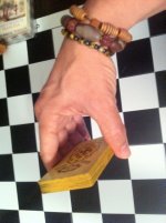
Thanks to Ladybird's great how to youtube video about edging or staining decks, I decided to get the Vintage Photo stain and I just did the Samhain Lenormand and one of my Vintage German decks, both decks from Seven Stars. Wow, the Vintage Photo by Tim Holtz in the Distress Ink pad worked like a charm. I am SO not handy, but as the edges of the Samhain Lenormand match so well, it was pretty impossible to mess it up. Even on the Vintage German, and I did the one that as the kind of olive-colored back, if I got a little on the card, I just rubbed it in, rather than wiping it away and it just made it look even more vintage. I plan on getting the Antique Linen to do some other decks, but it just makes such a difference. Like having a great back to a deck, having the sides look like they match the deck, rather than just always being white, just adds that extra something.

SO THANK YOU LADYBIRD!
 

Autumn Spice

I agree. Decks look so nice with the edge treatment.

Last weekend I was able to find the big jumbo marker. It was hard to find in my area. I also bought some of the ink pads to use.

I will start to edge treat tomorrow. I'll post some pictures after they dry. I'm so glad you're doing this too.
 

greatdane

Anyone use the Tim Holtz Distress inks AND have this deck?

I would like to do the edges of my Lilac Twlight, not the original, the one that was part of the Lilac/Cherry combo. Trying to figure out which of the inks (I see two lavenders) would best match the edges (I am heavy handed, I do more than one swipe as I don't do to make the deck look old, but to try to match the borders). So...any suggestions, oh AT Craft-y people? :) I think I have given up on trying to find one that is gray enough for the Mysteries of the Old Castle, the Pumice I think would be too...GReige?
 

Autumn Spice

You are so lucky to have found Mysteries of the Old Castle. I love the cards I've seen.

Did you see the deck in the video done with black soot ink? Maybe that could work? It does not look black on those cards.

I have no idea of the card or ink color in person.
I wonder if you could do the first layer with black soot and then a few layers of pumice? You could try it on index cards first to see the color mix in a bigger area. Ink an inch or so of a corner.
 

FLizarraga

I would like to do the edges of my Lilac Twlight, not the original, the one that was part of the Lilac/Cherry combo. Trying to figure out which of the inks (I see two lavenders) would best match the edges (I am heavy handed, I do more than one swipe as I don't do to make the deck look old, but to try to match the borders). So...any suggestions, oh AT Craft-y people? :) I think I have given up on trying to find one that is gray enough for the Mysteries of the Old Castle, the Pumice I think would be too...GReige?

Do you want a darker grey or a light, luminous grey, GD? There are several possible alternatives. Silver could also work (I'm thinking Tsukineko Brilliance Starlite Silver, which is not too light).

I thought that the Antiquarian in the bridge size would look too gloomy with black borders (I like them in the Tarot size deck, though), so I did them in Wild Honey to match the bronze or dark gold details in the backs.

And I have found that sometimes matching the borders with the rest of the card does not work as well as one thought it would. For instance, I did the borders of the Les Vieux Jours in Mustard Seed. It matched the yellow backs exactly and looked, I don't know, kinda blah. So I redid them in Wild Honey and distressed them a little. I like them much better now, but YMMV, of course.
 

greatdane

Hello Autumn Spice And Flizarraga!

I want to match rather than just make a deck look older and I understand the distress inks do wear off as time goes on and you use them. I really used a lot on the Samhain Lenormand so it looks like a dark reddish brown and it's really consistent, it's not a little in one area, a lot in another. Took me about four or five swipes. I would like to do a gray perhaps slightly darker than the edges of the Mysteries of the Old Castle, but I am debating whether or not to just leave it alone. It does change the texture of the edges a bit, making them feel a little more worn. But the Samhain Lenormand with it's many layers of Vintage Photo ink looks divine. :)
 

claire1805

Thank you for opening this thread, GD! >_< It made me want to do some edge treatment myself on one of my Lenormand decks. But I am afraid of softening the cardstock and staining the fronts of the cards... Maybe I will start with an old Lenormand deck that I have handled alot but recently stopped using due to clumps of 'dirt' sticking to it. I am thinking of getting the Milled Lavender distress inkpad for a try.
 

FLizarraga

Good morning, GD! :)

Don't worry, I understood what you wanted. I just wanted to know what shade of grey you wanted, and to warn you against what happens sometimes when you match too perfectly the borders with the backs.

I also did my Samhain Tarot of the Bastard in Vintage Photo, and it does look a treat. But when I did my Tarot of the Wyrd in the same color, the whole thing just looked like a block of wood! I did some metallic distressing with hints of gold and bronze (as if the deck had been gilt at some point), and now I think I went a little overboard, but at least the block of wood effect is gone. And one can always darken it later.

Back to the Mysteries of the Old Castle: perhaps you may want to try first Weathered Wood. It's a sort of darkish, greyish blue or bluish grey, and it might match the borders, or at least look good with them. Black Soot would also look good, but I would try the lighter color first. There's a shiny black, too --it's Tsukineko Brilliance Graphite Black. I had another here that I thought it would be grey, but it's sort of greenish, that wouldn't be good.

You can also do a two-tone deck --edge half the cards in one color, half in another. I may do that with the Antiquarian, retouching half the cards with Vintage Photo. Of course with Lenormand there are only 36 cards (or so), and they are always smaller than Tarot cards, so there's only so much you can do.
 

FLizarraga

Les Vieux Jours

Anyway, here's a before and after of the LVJ, so you see what I'm talking about. The first one already has some touches of other colors, but you can still see the canary effect; then I went over them with Wild Honey.
 

Attachments

  • LVJ 1.jpg
    LVJ 1.jpg
    51.6 KB · Views: 222
  • LVJ 2.jpg
    LVJ 2.jpg
    95.9 KB · Views: 218

greatdane

I hear what you're saying, Flizarraga!

It's a slippery slope....one must be careful. The Vintage Photo (about FOUR coats!) looked great on my Samhain Lenormand, but that was an unusual deck and the edges were kind of blended anyway. It's like I don't want to be too matchy matchy, but on the other hand, I didn't want it to just look...dirty...which would be easy with gray. I just showed a friend who also has the Samhain and she liked the look of mine and I gave her the distressed ink pad as I think I'm done with it for now anyway, having done two decks. It's hard when you're doing decks that aren't cheap or oop! I would rather leave some alone than mess than up.

OH THAT'S LOVELY, FLIZARRAGA! GREAT JOB. Loved how you edged it :)). Great idea about doing the half the cards in one color, half in another. The Weathered Wood sounds really good. I wish the names of the ink were a little more specific, I mean weathered wood can be many tones! Thank you for answering that, THAT sounds like a good place to start.

Don't be afraid, Claire, but I must admit the Samhain was easy because if a bit got on the edge, I rubbed it in whether than wiping it off, because it blended so well and just encouraged the aged look.