The Wickwillow Tarot formerly the Stained Glass tarot

Mallah

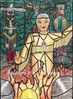
The Storyteller is my Hierophant. This is quite a departure from traditional Hierophant imagery. I have a more positive take on the hierophant, I think, than many people. Lots of folks take the NEGATIVE meanings and put them for the upright meanings.

My storyteller is the tribal keeper of oral tradition...I hesitate to say whether the Storyteller is male or female. But the stories that are told are the old myths. The Ancestors look on from the carved idols/totems in the shadows. The storytellers audience is rapt. They hang on every word...but are these stories JUST stories, or are they true? They have shaped the way the tribe has walked for countless generation upon generation.

Even today in the digital era, we LOVE our stories...the stories that move us in movies have the same underlying themes (love, romance, tragedy, redemption, sacrifice, infatuation, creation...) that they did hundreds of years ago. They are the themes pictured in the Tarot! So a negative spin on the Hierophant card is just a shame...at least upright.

"Tradition" certainly can become a prison if it becomes just form and practice with no glowing shimmering inner meanings...but the storyteller's eyes glow with inner light....the storyteller has something AMAZING for you....will you listen, or yawn and go away and play a video game filled with swords and epic battles?

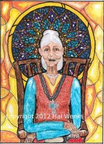
UPDATE: The ELDER replaces The Storyteller. Still all those storyteller aspects, but a much better card.

It occurred to me while working on this card that depicting an image that's all about tradition, UNTRADITONALLY might not be what people would want. There will probably be a TRADITIONAL Hierophant/Pope image available as a "tweak" card (there will be several optional cards like this.)
 

Attachments

  • 05 The Storyteller (Hierophant).jpg
    05 The Storyteller (Hierophant).jpg
    127.3 KB · Views: 130
  • 05 The Elder 2.17.12.jpg
    05 The Elder 2.17.12.jpg
    120 KB · Views: 109

Mallah

The Lovers

This is a card with deep imagery, even though it looks fairly simple.

Card 6 features the 6 pointed star. Latin for six is sex. Not without reason. The 6 pointed star is fire and water combined...love and lust. When fire and water are combined we get life...BLOOD.

The rose, being a symbol for love and life, drips blood; in myth, love, and orgasm were equated with death...the death of the individual ego.

We only see the hands of the Lovers...they might be same sex. We see they are interracial as well. If I'd shown more of their identities, we would lose this ambiguity. This card can go lots of ways.

When I did my original deck 20 years ago, the love card was a lot like this.
 

Attachments

  • 06 The Lovers card 1.12.jpg
    06 The Lovers card 1.12.jpg
    118.5 KB · Views: 134

Mallah

Hi Everyone. I just posted over in the critique thread, and wanted to add some of the observations I made over there, over HERE. Reason for that is that I haven't been drawing any comments (well, one person has been, thanks, BJ) but I thought it might help to make clear just what I'd like to hear, and how I'd like to interact with you forum participants over the creation of my deck!

In light of that, let me run by you what i said over there: In this quote I say that this thread has been up for a "couple of weeks..." LOL I didn't realize it's only been 5 days! I've been buried in the work of it, and hadn't realized it's been that short a time. Anyway...


"...it's been up for a couple of weeks, and drawn veiwers, but only one person has commented at all, what am I to make of that? It's bloody awful? It's boring? It's good, but not that good? I've continued to put the cards up, though, and am just about to the place where I'm up to the card I'm currently working on....(The Wheel(s) of Fortune). As I work, I find I'm getting better and better at depicting glass with colored pencil, and the styles I'm trying to emulate...what I'm trying to convey...and know I will be going back, ONCE AGAIN, to re-do a number of the cards to bring them up to spec. HOWEVER, have sort of decided not to do that till I have the whole thing done, because if I keep getting better and better, I'm going to want to apply all those skills, and I don't want to re do them NOW and then THEN too.

Point is, I WANT the critiques...not only of individual cards, but discussion of how to symbolize certain things in certain cards, and the overall decisions that must be made about decks...to publish or self publish, to use pips or scenic...what about my idea of offering both? Nobody in there commenting, so I'm getting no help at all...

I value my taroista buddies...and like criticism. I've been a professional theater person for quite some time, and am used to getting my "notes" from the director every day...and they are usually critical.

What the people criticizing have to understand, is that I'm not going back and making the changes NOW, however...I'm going to wrap around at the end of the deck (perhaps at the end of the majors) and applying changes THEN. "

All that being said, I invite one and all to participate in these ongoing pieces in FLUX. These cards are by no means done, and when i get you up to the Wheels of Fortune, I hope to discuss with you all the angst that the card has put me thru in order to settle on an image. In light of that, I'll post the Chariot, Justice and the Hermit today, so we'll be up to where I'm at.

I WANT POSITIVE AND NEGATIVE CONSTRUCTIVE CRITICISMS ON THESE. HOW AM I DOING??
 

Mallah

Chariot card

I think I've done this one now 3 times in color. The chariot is carried along by genii... before the chariot passes thru the cloud, it is differentiated, but after passing thru the wheels, the colors are "blended".

The background is getting closer to looking like glass...but it's funny, the laptop screen I use doesn't show the colors as "yummy" as a desktop monitor...anyhow, it's the PRINT that will count.

I'm using jpeg here...though the original scans are .bmp bitmap. Anyone know if TIFF or GIF might look better? I haven't tried them.

My charioteer is supposed to look a little full of himself. I equate the chariot with the teen years...when we get away from mom and dad and get the keys to the car! He reminds me of prince charming from SHREK. And here is another example of the stained glass NOT extending to the character himself...just the background.
 

Attachments

  • 07 Chariot v3.jpg
    07 Chariot v3.jpg
    129 KB · Views: 130

Mallah

Truth (justice)

This card was based on this video.

http://youtu.be/8XGIRLwcw4o

I know it's nothing new around here. I wanted to put a twist on the card...and she certainly does it...she has such perfect...balance! LOL.

Again, stained glass in the back, which adds color to the card....

Justice has always been a very "stark" card...and I see no reason that the notion of JUSTICE need be so unapproachable... are we all so out of balance that we fear cosimc retribution? It this why the justice card has always seemed so cold? (I get the same when I read what others right about Geburah on the tree...) Correction and adjustment is a GOOD thing. (This is perhaps why I ask for your criticisms!) This card took a long time to get the figure to be proportional...i'm only starting with figure drawing, but I don't think it's too bad....sometimes the her right arm looks a little long...but then, maybe that's the "long arm of the law?" LOL.

I thought the black of the costume and the temple would "pop" against the window. Personally I'm thinking of breaking up the colored fields in the window with some irregular grout lines. I think it needs that.
 

Attachments

  • 08 Justice (Truth).jpg
    08 Justice (Truth).jpg
    114.2 KB · Views: 110

gregory

There are things I WOULD say - were it not that you would have VERY great difficulty changing things and it's your deck, and it is a matter of taste... Because there are a couple of things that bug me - but they aren't about symbolism, and - well, just because I happen not to LIKE them isn't the same thing as there being anything WRONG with them.

But - well, let us say that the Empress reminds me of Lesley Ash - and not in a good way. IS that the kind of thing any artist wants to hear ? After all - it is also well known here that I find Michaelangelo's David ugly.... (There are also some cards I particularly like; don't get me wrong. But - is a remark like I just made in any way helpful to you ?) I too like the Emperor - a lot.
 

Mallah

The Hermit.

I'm getting better. This is probably the best one yet. Again, the laptop monitor is sort of dulling the glowing colors down.


This is a pretty basic hermit image...but he has the hourglass...that's ALSO a lamp, and ALSO incorporates the controversial snake, here as a lemniscate, which is going to be a major component of the deck and the writing that goes with it, as I feel the lemniscate is a key form of layout for the major arcana.

The hermit represents that point on the lemniscate where we are about to leave the first, outward facing circle and plunge inward to the inner facing realm.

I wanted the rusts and earth tones because of the Virgo associations of the card.

Comments? Critiques?
 

Attachments

  • 09 The Hermit card.jpg
    09 The Hermit card.jpg
    114.7 KB · Views: 124

Mallah

There are things I WOULD say - were it not that you would have VERY great difficulty changing things and it's your deck, and it is a matter of taste... Because there are a couple of things that bug me - but they aren't about symbolism, and - well, just because I happen not to LIKE them isn't the same thing as there being anything WRONG with them.

But - well, let us say that the Empress reminds me of Lesley Ash - and not in a good way. IS that the kind of thing any artist wants to hear ? After all - it is also well known here that I find Michaelangelo's David ugly.... (There are also some cards I particularly like; don't get me wrong. But - is a remark like I just made in any way helpful to you ?) I too like the Emperor - a lot.

THANK YOU for saying something....LOL I have NO idea who Lesley Ash is...but you can bet your life I'll be finding out! The Empress will probably have to be re-done anyhow...and I'll look into it...is he/she an artist, and it's the STYLE that it reminds you of? Or is It the person that my character bears a resemblance to? Personally I think she looks like Janice from the muppets...you know..the bass player? (Fer Shur...TOtally...)
LOL.

I will say that my characters are all quite cartoon-y. That's just the way they come out!
 

gregory

THANK YOU for saying something....LOL I have NO idea who Lesley Ash is...but you can bet your life I'll be finding out! The Empress will probably have to be re-done anyhow...and I'll look into it...is he/she an artist, and it's the STYLE that it reminds you of? Or is It the person that my character bears a resemblance to? Personally I think she looks like Janice from the muppets...you know..the bass player? (Fer Shur...TOtally...)
LOL.

Lesley Ash is a British actress who had some rather disastrous collagen lip injections that left her - well, I am sorry to say - looking a little deformed in that area, She sued. A LOT ! She also got some kind of post op complications and almost died - but it is the lip look that is so - extreme...
 

starlightexp

First off I have to say that I’m a HUGE fan of the God Tarot and find the book and take on the cards to be hugely unique in the landscape of tarot. I want to start off saying that I by no means consider myself an artist and have huge respect for those that are and so no offense is meant. Also if any of what I question is an artistic choice just ignore my ramblings.

This deck has not quite grabbed be yet. I like the idea, as I do stained glass as a hobby, and I have several decks that are done in that style.

The use of the lead line look is a bit uneven. It looks like, especially on cards such as The Fool and Empress, that the lines are an after thought. When taking a class we were taught to do all we can to use the lead lines as part of the image. They should flow with the art not against it. When planning out a piece to make it was how to use as few pieces of glass as possible to get the effect. The Empress, to me, came across as if the image was done then the lines were put in when it was done. I almost feel that the “leading” should flow up and down with the trunk of the tree rather then break it apart. But in the Magician, Emperor and Lovers they go amazing with the image.

May I ask what medium you are using to make the images? When I think of stained glass the colors are rich and saturated. The Magician is wonderful in both the line work and use of color. It LOOKS like a glass window, but several of the other cards look rather pale in the use of color. In glass making whenever you change color then you need to change glass. Unless it is a patterned glass or detail work is done as a relief in the glass to really be seen when light is shining through it. If these were richer in tone I bet they would look great as a transparent deck.

Just small details that, again my be artistic choices, I see that throw me off. The detailing on the harp is outstanding, but it draws me to the hands of the Empress which almost look like claws. Some of the facial features look a bit..well..off center. Everyone has their own artistic style so this may be just rambling now.

I like the concepts of the cards and think there is something to be had there, and I do watch the thread.