an experiment at gilt edging

kalliope

Are the tsukineko ink pads shiny shiny like chrome?!

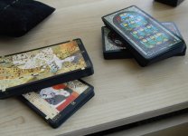
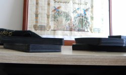
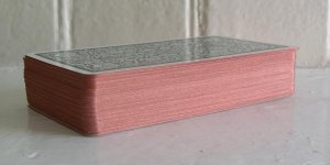
The Tsukineko ink pads to shine, as you can see in the images above. I used the copper one for my trimmed Tarot of the Magical Forest, which has become one of my favorites. They actually shimmer and gleam in light.

My post with images is here: http://www.tarotforum.net/showpost.php?p=2641358&postcount=97

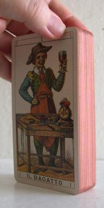
I agree with aurarcana that the Tsukineko Brilliance ink pads do shimmer and gleam, but I would say they are NOT shiny-shiny like chrome. If you look at my post in this thread I have pictures of my trimmed and gilded Golden Tarot. The "before" picture shows the original gilt edge, which does indeed super-shine like chrome. My after pictures show the more shimmery metallic effect from the Tsukineko Galaxy Gold, which looks similar to the results that Cassandra got with her Deviant Moon.

I don't mean to split hairs, but I wouldn't want you to be disappointed if you were to try it yourself with glossy chrome expectations, that's all. :) It's also completely possible that I just have bad application technique that leads to metallic-but-not-super-shiny results!
 

kalliope

black edges on black bordered deck is lovely. i've done LoTD and Vetrate before, doing Klimt now. Will try to post pictures later if I've time....

I'd love to see pictures of your black-edged decks. I recently got the Vetrate, and can see how non-white edges would look great. I wonder if either of the black metallic colors by Tsukineko would be black enough?

Also -- do I spy an awesome Arc notebook in your Deviant Moon pics? I love those. :D
 

Cassandra022

I'd love to see pictures of your black-edged decks. I recently got the Vetrate, and can see how non-white edges would look great. I wonder if either of the black metallic colors by Tsukineko would be black enough?

Also -- do I spy an awesome Arc notebook in your Deviant Moon pics? I love those. :D

i shall post pics up when i get home. i have vetrate black gilted as well but that one was done with rub and buff, not tsukeniko pads...maybe ill post pic of both for comparison if i get the chance...

and yes, it is an arc notebook. i love it too :]
 

Cassandra022

ok, as promised. the deck on the right is vetrate gilted with rub and buff black. the deck on the left is klimt with tsukeniko graphite black gilt.
 

Attachments

  • black_gilt1.jpg
    black_gilt1.jpg
    258.8 KB · Views: 287
  • black_gilt2.jpg
    black_gilt2.jpg
    179 KB · Views: 261
  • black_gilt3.jpg
    black_gilt3.jpg
    249.2 KB · Views: 250

kalliope

ok, as promised. the deck on the right is vetrate gilted with rub and buff black. the deck on the left is klimt with tsukeniko graphite black gilt.

Oh wow, those look fantastic! Black edges really set off the colors. Makes me want the Klimt, too. :) Thanks so much for posting them.

Edited because I missed that you used the Tsukineko on the Klimt. I was wondering if it would be as inky black as the Rub N' Buff, so good to know it is (or nearly anyway).
 

Cassandra022

yeah, the color is a bit deeper with the rub and buff, but on the other hand, i was able to be more aggressive with that one because with black, if it gets on the edges of the cards a bit you can't tell anyway which saves a lot of trouble. the klimt on the other hand has those gold bits, which make it so you can tell, so i was a bit more careful/light of hand while doing it.

Also, i'm starting to realize cardstock matters in terms of gilting results. as in, using the EXACT same gilting supply and color got me rather different results on USA games cardstock vs. AG Muller cardstock, and some decks are just terrible to try gilting (light and shadow) whereas others are great for it. I think Vetrate falls into the great category :]
 

Cassandra022

so i've come to the conclusion that i just don't like the tsukeniko cosmic copper color very much. put it on my newer thoth and just...wasn't working. the black and silver tsukeniko are fine, but as far as copper goes...got me more spanish copper rub and buff and redoing this thoth deck with that...its worth the extra effort for the nicer color, to me. cosmic copper is too pinkish...
 

Laura Borealis

Tsukineko's Cosmic Copper is on the pinkish side, agreed. It's like new copper: think brand-new penny. After applying the second coat, I decided I quite like it. It compliments both the fronts and the backs of my deck. And I'm wondering if a more antique copper would just look brown in most lights.

Deck: LoS Ancient Italian.

The first two pictures show the edges; the third is just for fun, showing a batch lying out to dry on my mantle.
 

Attachments

  • Shiny_Happy_Edges.jpg
    Shiny_Happy_Edges.jpg
    40 KB · Views: 231
  • Shiny_Happy_Edges_pt2.jpg
    Shiny_Happy_Edges_pt2.jpg
    41.2 KB · Views: 230
  • Drying_Cards_Laid_Out.jpg
    Drying_Cards_Laid_Out.jpg
    47.9 KB · Views: 215

GoldenWolf

Just wanted to comment briefly on the gilded issue. I have some success in touching up already gilt edges that chipped with a leafing pen. They are much more intensely metallic than the metallic ink pads are. Here in the US, Krylon makes them and they can be found in most craft stores. There are a couple shades of gold, silver, copper and a red gold. Be careful of getting them on the front if you don't want the color there. Practice on plain cardstock first to get the hang of it. Make sure you prime the pen according to the directions. The only other caveat I'd give is try not to get the ink on your hands. If you do, wash it off immediately and thoroughly. Sadly, the more beautiful and more metallic, the more toxic the pigments can be.