greatdane
I got my Samhain Lenormand 2015 in the mail yesterday.
Seven Stars posted pix of it in Adverts under her My New Samhain Lenormand thread.
It didn't disappoint!
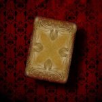
First, the DECK:
While her previous Samhain Lenormand was dark, literally, this one has more of a muted sulfuric presence. The color palette is very subdued with a lot of olive, brown, dark yellow, which makes even the muted reds and pinks pop more for me. It has a great vintage feel because of the tones.
There are quite a few changes besides the color tones. Some subtle changes, some totally different cards, but all with a great VINTAGE vibe.
Some of my favorite new cards or images are:
The SUN (WHAT a GREAT SUN CARD!), the MOON, the CHILD (there are two Child cards, so you can choose one or decide to incorporate them both in your readings) are among many new cards I love.
The COFFIN has a faint ghostly presence standing next to it.
The SCYTHE is held by what looks like the Grim Reaper.
The SHIP is flying a pirate flag.
The ANCHOR has a skull and cross bones at the bottom of the card.
There are many other subtle, but important (to me), changes that add to the moodiness. Thinly-veiled spider webs, bats flying.
The card stock is the great linen I love and shuffles like a dream.
The mini surprised me at the great detail which can sometimes be lost in a mini, but not in this deck. Even these old eyes can read with it and it comes in it's own little white tuck box with a cellophane window.
The EXTRA cards are great vintage pix with verses and I love them so much, I'm thinking of adding them under the glass top of a small table I have I can do readings on top of.
I will add some more thoughts about the rest of the package (the MAT and COMPACT) in just a bit.
Seven Stars posted pix of it in Adverts under her My New Samhain Lenormand thread.
It didn't disappoint!
First, the DECK:
While her previous Samhain Lenormand was dark, literally, this one has more of a muted sulfuric presence. The color palette is very subdued with a lot of olive, brown, dark yellow, which makes even the muted reds and pinks pop more for me. It has a great vintage feel because of the tones.
There are quite a few changes besides the color tones. Some subtle changes, some totally different cards, but all with a great VINTAGE vibe.
Some of my favorite new cards or images are:
The SUN (WHAT a GREAT SUN CARD!), the MOON, the CHILD (there are two Child cards, so you can choose one or decide to incorporate them both in your readings) are among many new cards I love.
The COFFIN has a faint ghostly presence standing next to it.
The SCYTHE is held by what looks like the Grim Reaper.
The SHIP is flying a pirate flag.
The ANCHOR has a skull and cross bones at the bottom of the card.
There are many other subtle, but important (to me), changes that add to the moodiness. Thinly-veiled spider webs, bats flying.
The card stock is the great linen I love and shuffles like a dream.
The mini surprised me at the great detail which can sometimes be lost in a mini, but not in this deck. Even these old eyes can read with it and it comes in it's own little white tuck box with a cellophane window.
The EXTRA cards are great vintage pix with verses and I love them so much, I'm thinking of adding them under the glass top of a small table I have I can do readings on top of.
I will add some more thoughts about the rest of the package (the MAT and COMPACT) in just a bit.
 i am really looking forward to mine!