The Gilded Tarot Royale

euripides

I have been thinking about this and it reconfirmed (as if reconfirmation was needed) as to the almost unique relationship of the art of tarot and the tool of tarot. While one strives to consider the implications of every aspect of an image knowing that it will be studied in detail, it is nevertheless impossible to cover the infinite varieties of interpretation that will result. Nevertheless, feedback such as your interpretation can be extremely useful. Clearly to accommodate every suggestion and preference is futile and even if attempted would result in a "design by committee" blandness.

This is very important - I think while valuing feedback, trusting your own instincts is vital. It's the unique viewpoint and expression that makes each deck have its own special voice.

While tradition should be respected, it shouldn't be a straightjacket. Readers will inevitably bring their own baggage to the deck anyway, good and bad.

The other day I commented on a reading with the Gilded 'World' card, and for me it was a great deal removed from the interpretation that I might have given that card in any other deck; but there's an internal consistency within the deck itself.

In the future I expect to see readings which use cards drawn from both decks! How interesting to see the relationship between the old cards and the new - what's changed, what has stayed the same!
 

cirom

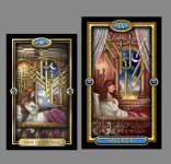
The nine of swords
 

Attachments

  • NG 9 SWORDS comparison.jpg
    NG 9 SWORDS comparison.jpg
    285.5 KB · Views: 242

merissa_88

I love the swords in this one. There's more distress in the image. It's not just depending on the woman to give the meaning.
 

Open Arms

Five simple little words

Where

Do

I

Buy

It?

The Gilded is my go-to deck and the first one I owned that actually zapped me when I took it from the box.

As usual Ciro - your talent amazes me.
 

BlueDragonfly

On comparison, there is one thing(okay two) about the older version of the card that appeals more to me, some of the colors. The underlying color tones(ceiling and wall) seem softer/warmer in the Royale version, and don't evoke quite the same feeling of despair.

And the girl's legs in the newer version laying flat don't look to be in quite as natural a position......in the original version being drawn up, knees bent like she's about to curl into herself.

However in the larger sized card, the details like the moon and owl in the window, for example, are in better proportion. I prefer the angle of the ceiling tiles in the newer version, as well.
 

Stormdancer

On comparison, there is one thing(okay two) about the older version of the card that appeals more to me, some of the colors. The underlying color tones(ceiling and wall) seem softer/warmer in the Royale version, and don't evoke quite the same feeling of despair.

And the girl's legs in the newer version laying flat don't look to be in quite as natural a position......in the original version being drawn up, knees bent like she's about to curl into herself.
I agree with both of these points and she put it better than I ever could. I also like the swords in the first version better. They seem more "chaotic" somehow, and that's kind of what this card means for me.
 

Elendil

I think the girl in the newer version looks too comfortable and too composed like she may be meditating. The anguish and more restless and fearful pose of the first girl is better for the way I personally interpret this card - but the rest of the details are more aesthetically pleasing and balanced. I like the addition of the curtain/veil which adds to the sense of 'lack of clarity' which compounds the fears that this card often 'speaks' about.
 

AngelC

I'm a bit torn since the new images are in many ways improvements but I do miss the softer light and edges of the old one.
These new ones look more like the ToD than a reworked Gilded if that makes any sense since the whole feel of the Gilded that made it different isn't there in the new ones.
The Six of Swords is one card where that makes me prefer the old one without hesitation, the other cards I'm less certain about.

Still, can't please everyone and in the end it will end up being a deck I want.

Keep up the beautiful work Ciro :)
 

cirom

Thanks once again for the feedback, all of which is interesting and I may well take a comment here or there into consideration before finalizing each card. But having said that, the real objective of my posts is two fold. Based on past projects, people seem to enjoy seeing and participating in a sense, in the production process of a deck. Secondly in this particular case its to provide a reasonably clear reference of the difference between the two versions of the Gilded. This I think is necessary as there will obviously be three distinct audiences. Those who have the first version and might be interested in this new one. Those who did'nt like the first, but might like this one, and potential newcomers who are unfamiliar with the original. In all three cases there may well be a confusion having two related decks in the market sharing similar imagery and titles.

As I believe I mentioned earlier. The purpose of this project from my perspective is primarily one of technique, illustrative style and detail, which I consider to be an improvement and one which creates a more convincing visual scene in which readers can lose themselves (or find their way). Now of course on an emotional level all bets are off, how anyone responds to a choice of color here, and facial expression there is very personal and there is no way around that. Hopefully the majority of these changes are considered improvements, even if they may require some adjusting to from a reading perspective by those already familiar working with the original.
 

Tibor

I think the girl in the newer version looks too comfortable and too composed like she may be meditating. The anguish and more restless and fearful pose of the first girl is better for the way I personally interpret this card - but the rest of the details are more aesthetically pleasing and balanced. I like the addition of the curtain/veil which adds to the sense of 'lack of clarity' which compounds the fears that this card often 'speaks' about.

Ciro I agree with the comments. At the least the girl on the newer version should look a bit paler (like it was in the original). If nothing can be changed in terms of posture at least her complexion should change (if possible). Anyway it's just that the 9 of swords is actually one of my favourite cards as well and for some reason it has to come across more worrying for its meaning to be conveyed appropriately. Oh well at the end it's just my opinion so if you decide to keep it that way that is fine too.