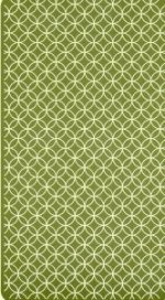
New Rider Waite Card Back!

53rdspirit

I'd prefer the back without the large signature in the two corners (it's overkill to me), but other than that, I like it much better than the plaid.

I know I'll be purchasing the deck when it comes out.

~53rdspirit
 

The 78th Fool

I think this is awesome! This new edition looks like it's going to do full justice and more to the deck. My birthday's in May so this couldn't have been timed better!

There's been a thread started on the same subject in the Tarot decks forum. I've cross linked to it and copied the back design pic over to that thread as well. Everyone over there had been asking the same questions about the back design.

http://www.tarotforum.net/showthread.php?p=1783031&posted=1#post1783031


Chris. xx
 

Abrac

I don't like it at all. To me it just looks uninspired, especially for a 100th anniversary edition. I like the Rider deLuxe back better than this one. I'm not trying to kill anyone's buzz, that's just my opinion.

My mother always said if you can't say something nice don't say anything at all; I probably should listen more to her advice. :D
 

Dean

53rdspirit said:
I'd prefer the back without the large signature in the two corners (it's overkill to me), but other than that, I like it much better than the plaid.

I~53rdspirit

Yes i agree with that, but other then that it looks alot better without having all those flowers on mine.
 

Asher

Abrac said:
I I like the Rider deLuxe back better than this one.

While I do like the new 100th anniversary back, I also really like the DeLuxe back. I had forgotten all about it, just got it out to look. Here's a scan of it.

Asher
 

Attachments

  • RiderDeluxeback.jpg
    RiderDeluxeback.jpg
    38.7 KB · Views: 210

Dean

Asher said:
While I do like the new 100th anniversary back, I also really like the DeLuxe back. I had forgotten all about it, just got it out to look. Here's a scan of it.

Asher

I don't have the Deluxe one but that picture looks alot better then the flowered lillie back.
 

Miss Divine

Abrac said:
I don't like it at all. To me it just looks uninspired, especially for a 100th anniversary edition. I like the Rider deLuxe back better than this one. I'm not trying to kill anyone's buzz, that's just my opinion.

My mother always said if you can't say something nice don't say anything at all; I probably should listen more to her advice. :D

You're not the only one that doesn't like it!
 

Vardigon

Dean said:
I don't have the Deluxe one but that picture looks alot better then the flowered lillie back.

I agree. The deluxe back looks awesome compared to the flowered lilly one. That's such an off-shade of blue. Maybe they were going for something that looked old and faded by the sun? Also, the deluxe back looks like it runs to the edge of the card, while the anniversary backing appears to have a white strip bordering the image. (Even if it doesn't, it still looks better, hehe.)

Teachers used to get angry at me in gradeschool for not filling in the whitespace in colorings.
 

northsea

yay

Almost anything is an improvement on the generic tartan.