Which deck has your favourite and least favourite back design/colour ets and why???

desertrat

I am only able to remember the backs of the decks I've most recently used. Of these, I truly love the Golden Botticelli backs. The back of the Tarot des Templiers is also very lovely and elegant. Also a fan of the Rumi, Mantegna and Energy tarot backs. Generally I tend to swoon over geometrical designs, mandalas and patterns.

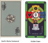
I tend not to enjoy backs that have a picture of something, such as the Golden Dawn Magickal tarot, the Hoi Polloi (plus - not a fan of the color), Arthurian Tarot, most LoS decks, Merlin Tarot. I agree with others that the Robin Wood is rather unattractive.
 

Freddie

For colouring, I will have to go with 'The Buddha Tarot', Fournier 'Tarot De Marseille' and 'Albano-Waite'. These three decks really speak to me through their somewhat psychedelic use of colour, shades and tints. I never seen to get tired of looking at them.


For a back design, the 'Dark Grimoire' just slays me beyond words.


Freddie
 

PiscesMale

For me a good example of a card back that suits the front images/style is the Sola-Busca. The images of the Aquarian Tarot really speak to me but the back of the card design and color is a complete mystery to me as to who might have thought it complimentary. Which is why I am looking for an older edition of that deck, though even the color blue on the back is of contrast to images of the Aquarian Tarot in my opinion.
 

Penthasilia

I :heart: LOVE :heart: the Crystal Visions Tarot backs. I just think they are beautiful! :)

BeyondtheVeil

I second this. This deck probably has one of the most beautiful backs that I have seen.

I also like the backs on the Maroon tarot.

And though I don't have it anymore- the backs on the Vampyres tarot were also lovely.
 

Dan S

Like: the rose-flower backs of the 1st and 2nd editions of Place's Alchemical Tarot
Do Not Like: the unappealing color combination on the backs of the 3rd Renewed edition.
 

GryffinSong

I absolutely LOVE the backs on Kat Black's Golden and Touchstone tarot decks, as well as the Baroque Bohemian Cats Mini deck and the Old English Tarot. These four have lovely all-over patterns that actually complement the deck.

I also ADORE the Fenestra backs. I've almost bought the deck a number of times because of those backs, but I don't care for the card images enough.

Among the worst I've seen include the hideous stars on blue of the Morgan Greer. They are a prime example of one of my pet peeves. Designers, PLEASE, put a back on that actually relates to the card images!!! I'm talking style, color, design ... all should reflect the style of the deck itself. Do not just slap something on the back. Its annoying as heck.

Anyone who knows me knows that I LOVE the Baroque Bohemian Cats Tarot. But the backs on the normal-sized decks have nothing whatsoever to do with the style of the card images. Its annoying.

Druid Plant and Animal Oracles. Boring.
 

Richard

I don't spend much time looking at the backs unless they are interesting. I love the Wang Golden Dawn backs because they are beautiful and have a lot of stimulating Qabalistic symbolism. The backs of the the Smith-Waite Centennial are dull and drab, but that's okay because it's my favorite deck for other more important reasons.
 

Attachments

  • backs.jpg
    backs.jpg
    77.8 KB · Views: 132

mah jong

There's some gorgeous designs out there that are unfortunately not reversible. I want the back of cards to have a uniform look so that I can react fresh, when I turn them over and find them upright or reversed. Don't want to be tipped off before the card is revealed. Tarot Nova has a lovely intricate, and reversible design.
 

Dark Victory '39

Oh the ISIS

ISIS tdm backs I really love, which oddly enough i just commented on the other day. i wish i had a scanner at the moment. They are the most soothing shade of sea-green, and the pattern is muted but you see texture like tiny microbe bubbles or sandgrains. Also, because probably i like the lamination on the Tarot of Trees, i like the iridescent marker pens the artist used. I really like the Maat's feather over burlap, with that coral red accent color.