
You are using an out of date browser. It may not display this or other websites correctly.
You should upgrade or use an alternative browser.
You should upgrade or use an alternative browser.
The Gilded Tarot Royale
olarte
euripides
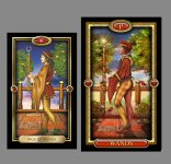
Page of Wands
Nice. I love the richer colours.
I'm not 100% comfortable with the profile, and particularly the shape of the neck... his head is just sat a touch uncomfortably. I feel the original page is anatomically more correct.
cirom
Nice. I love the richer colours.
I'm not 100% comfortable with the profile, and particularly the shape of the neck... his head is just sat a touch uncomfortably. I feel the original page is anatomically more correct.
Thanks.... I made some minor adjustments
")
Tibor
This page of wands is nice
BlueDragonfly
I like that the reds are more prominent in this one, the addition of the cardinals/red birds.
And I do really like the potential of the larger size cards!
And I do really like the potential of the larger size cards!
AngelC
I like that one it still feels like the Gilded, yet improved.
it still feels like the Gilded, yet improved.Glitterbird
Absolutley lovely!
Tomsde
I really like the revision work you've done; the figures are much more 3 dimensional now and the textures and colors are rich and vibrant. Best wishes with this editions publication. It gives me the inspiration to go back to work on my deck.
Penthasilia
Count me in (email sent)! I love all of your decks and am fortunate enough to have the limited editions of the last 2. I may end up buying two since my son uses the gilded tarot as his primary deck and will flip over this one
Amy
Amy
