truelighth
Ok, I finally got round to comparing this deck to the Roses&Lilies deck. And yes, it is, 100% a copy of the Roses&Lilies Pam-A. No doubt about it. All the little details are the same. You see the same dot pattern in the colours, as I described in the other thread. (there is a colour difference between the Roses&Lilies and crackled back Pam-A. The Roses&Lilies has more dot patterns, is more grainy and the colours are deeper).
So all in all it is a true and faithfull reproduction of the deck Stuart Kaplan owns. But... while comparing, I also have to agree with Coredil about the colouring. The colours are actually off. The colours of the Roses&Lilies deck are more subdued, even a bit washed out. But clearer then on this new Smith-Waite deck. You are quite right to call it the greeny RWS. All the cards are more greenish. On some of them, this actually gives the right effect and the cards look very similar to the original, like on the Moon card:
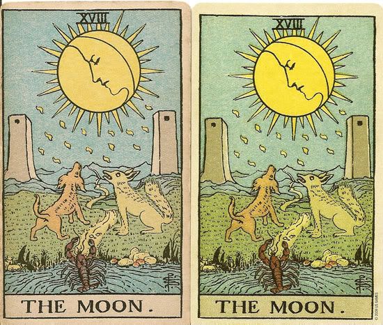
(the scan still shows a difference, but if you hold the cards next to eachother, you don't see this)
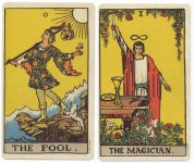
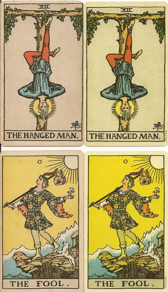
On other cards, especially the cards with a more yellow or grey background, it doesn't work so well at all and makes the colours more green all over, as can be seen in the Fool and the Hanged Man:
 F
F
or reference, the pictures show the Rose&Lilies on the left and the Smith-Waite on the right.
As to the why of this greenish tint, we can only guess. I don't know if this is due to the artificial aging of the deck. Or if it is an effect of the lamination. Or maybe they did it on purpose to make the colours brighter and more similar to the normal RWS (the Fool for instance is more like the normal RWS). All of those could be reasons, but it is a pity they made this adjustment and didn't print it with the original colours. Because it does make the deck darker then it needs to be and indeed, more greenish.
Other than that, it is a very good reproduction and I am still very pleased with the deck. And it is a LOT better then the "Original" RWS.
Oh yes, when looking at the scans I posted, you can see that some of the cards of the Roses&Lilies are indeed off center, quite of center in case of the Moon card. I did notice this in the Smith-Waite as well, but the smaller border is on the right of the card and not so extreme. It looks to me like they have been trying to correct the centering, but sometimes went a bit the other way.
So all in all it is a true and faithfull reproduction of the deck Stuart Kaplan owns. But... while comparing, I also have to agree with Coredil about the colouring. The colours are actually off. The colours of the Roses&Lilies deck are more subdued, even a bit washed out. But clearer then on this new Smith-Waite deck. You are quite right to call it the greeny RWS. All the cards are more greenish. On some of them, this actually gives the right effect and the cards look very similar to the original, like on the Moon card:

(the scan still shows a difference, but if you hold the cards next to eachother, you don't see this)
On other cards, especially the cards with a more yellow or grey background, it doesn't work so well at all and makes the colours more green all over, as can be seen in the Fool and the Hanged Man:
 F
For reference, the pictures show the Rose&Lilies on the left and the Smith-Waite on the right.
As to the why of this greenish tint, we can only guess. I don't know if this is due to the artificial aging of the deck. Or if it is an effect of the lamination. Or maybe they did it on purpose to make the colours brighter and more similar to the normal RWS (the Fool for instance is more like the normal RWS). All of those could be reasons, but it is a pity they made this adjustment and didn't print it with the original colours. Because it does make the deck darker then it needs to be and indeed, more greenish.
Other than that, it is a very good reproduction and I am still very pleased with the deck. And it is a LOT better then the "Original" RWS.
Oh yes, when looking at the scans I posted, you can see that some of the cards of the Roses&Lilies are indeed off center, quite of center in case of the Moon card. I did notice this in the Smith-Waite as well, but the smaller border is on the right of the card and not so extreme. It looks to me like they have been trying to correct the centering, but sometimes went a bit the other way.