nicky
what fantastic work!
I thought so too at first, but it's actually kind of a neat idea considering that some people trim the cards of other decks to eliminate the titles. In this deck, the titles can be more easily ignored, if you prefer that, and instead treated as a graphic adornment....It's probably my aging eyes, but unless the cards are in direct light, the lettering of the card names and Dominions(?) looks fuzzy...
From nemoslocker.com:...I guess the similarities to the RW might also render a book superfluous, but I'll ask anyway - might one be on the way, Nemo's Locker?...
I thought so too at first, but it's actually kind of a neat idea considering that some people trim the cards of other decks to eliminate the titles. In this deck, the titles can be more easily ignored, if you prefer that, and instead treated as a graphic adornment.
I know nothing about Lovecraft, either, and share your response to the drawings in a similar way. If familiarity with Lovecraft's universe is advantageous in interpreting the cards, it might be worth checking out some of that literature just as with any other dimension of the cards.
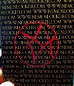
And the only thing I don't like about the deck is the card back. I think the red emblem is cool, but it's drowned out by the URL repeated over the card back. It doesn't look so bad on the website, but in person I think it's rather annoying. The deck title in a repeating pattern might have been one thing, but a repeated URL seems like overkill.
This isn't a trump, but the two figures on Five of Pentacles seem Neolithic to me....For some of the trumps I incorporated symbolism from some very old 16th – 17th century cards, as seemed appropriate, as well as some Neolithic art on one card in particular (I’ll let you guess which one)...
If I'm not mistaken, it is a self-published deck, so I wouldn't begrudge some self-promotion. The way the lettering on the back is arranged makes it look more like a texture than text, and the pentagram shown in a layer behind the lettering speaks to "reading between the lines" in order to understand the full meaning of the deck.Ah, as a Lovecraft fan and dedicated Arkham Horror player, this deck seems PERFECT for me, but the backs may keep me from ordering it. This was the same issue I had with Charissa Drengsen's Steampunk Tarot. Why put promotional material here? It seems tacky and highly detracting from the otherwise gorgeous aesthetic.