velvetina
Terrapin, I'm the same! I cannot bear (physically) the Albano-Waite..but now I'm intrigued...how does one become accustomed to it, I wonder?
It's probably not worth bothering about. The Aeclectic rating of the Albano is an impressive 2.5 stars. After all, it is merely --Terrapin, I'm the same! I cannot bear (physically) the Albano-Waite..but now I'm intrigued...how does one become accustomed to it, I wonder?
 (Also, I can't help now and then using a little tongue-in-cheek humor. )
The use of complementary colors (called "flashing" colors in Golden Dawn parlance) is supposed to attract the Akasic current, which in turn may assist clairvoyance. P. F. Case adapted the Golden Dawn color scales to introduce flashing colors into esoteric Tarot design, and Frankie Albano in turn applied the Case specifications to the Rider-Waite. I have attached an example to illustrate this. The P.F. Case BOTA Fool is on the left, the Albano is in the middle, and the Smith-Waite Centennial on the right.
In the BOTA and Albano, the Fool's outer garment is bright green with a red lining (green-red complementarity). Compare this with the dull green and orange of the Smith-Waite. The background of the BOTA and the Albano have purple mountains against a yellow sky (again, note the complementarity), whereas the Smith-Waite uses a slightly more harmonious greenish blue against a greenish yellow.
I find the Albano/BOTA color scheme to connect more readily to the Unconscious than the usual RWS colors, but this is not always desirable. The psyche can experience a sort of burn-out from too much stimulation.
As far as I know, the BOTA deck is available only with black and white line drawings, and the Minors are not illustrated. There are instructions on how to color the cards. I have a hardbound copy of P. F. Case's book, The Tarot, which has colored illustrations of the Majors. The paperback edition of the book has only black and white illustrations.How interesting! I do like the P.F. Case Bota Fool on the left. The drawings are quite significantly different in detail and aspect from the other two images. I like the colours as well in this particular card but would like to see the whole deck. Is the whole deck available on the net, or where else can I purchase it?......
Actually, the Pentacles and Temperance deviate somewhat from Colman-Smith's artwork, but otherwise it is just a "garishly" re-colored Rider-Waite.
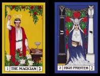
Yes, I forgot about the Swords. Thus there are a substantial number of cards which differ from PCS's original designs. Moreover, these are not insignificant details, they are changes in the actual emblems for two of the Tarot suits.The swords are different, too, enhanced with three jewels on the part formally known as the crossguard.
As far as I know, the BOTA deck is available only with black and white line drawings, and the Minors are not illustrated. There are instructions on how to color the cards. I have a hardbound copy of P. F. Case's book, The Tarot, which has colored illustrations of the Majors. The paperback edition of the book has only black and white illustrations.
So do I. Here are a couple more images from the book.What a pity. I like Case's colouring.
As far as I know, the BOTA deck is available only with black and white line drawings, and the Minors are not illustrated. There are instructions on how to color the cards. I have a hardbound copy of P. F. Case's book, The Tarot, which has colored illustrations of the Majors. The paperback edition of the book has only black and white illustrations.