Untitled Watercolor Deck: Slow-going WIP

Richard

......Those of you who remarked that the figures are too small, why do you feel that would be detrimental to reading with these cards?......
For example, consider the Hanged Man. Most readers are more interested in the man hanging upside down than whatever it is from which he is hanging. The focus is on the man, who obviously is seeing things from a different perspective, or perhaps he is engaged in a self sacrificial act; maybe he is a martyr, or even a criminal. Anyhow, the tarot reader's attention is likely to be on the subject of the card indicated by the title. Your Hanged Man is almost invisible. You may be making an artistic statement, but I think most tarot readers would prefer that the eye be attracted to the subject of the card rather than an interesting (and nicely rendered, by the way) rock outcropping. ETA. Or maybe it's a tree. There is an enormous rock outcropping not far from where I live, which is shaped like a man's face in profile.
 

Richard

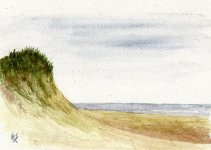
In case it was not clear what I was talking about in the previous post, here is a concrete example. Let's assume that your tarot paintings are representational (i.e., not abstract expressionist, for example). The title of the picture (such as the Emperor or the Hermit) should be the subject of the picture.

Here is a representational watercolor I did, called Dune. It is a painting of a sand dune on a barrier island where I was vacationing. (It started out as a pleine aire, but the wind got too strong, and I finished it back at the cabin.) If you look at the picture, your eye is immediately attracted to the subject. This is done using the obvious standard techniques of lines, size, detail, perspective, and color intensity.

If you want to be more sophisticated and non-representational, that's okay too, but it may not suit the preferences of the average tarot reader. The hard fact is that tarot is applied art, not pure art, so there are certain constraints on the artist's freedom of expression.
 

Attachments

  • dune.jpg
    dune.jpg
    60.3 KB · Views: 103

gregory

Thanks for the feedback so far, everyone! It's great to get some fresh perspective on these.

Those of you who remarked that the figures are too small, why do you feel that would be detrimental to reading with these cards?
Simply because they feel like added extras on a nice piece of scenery. The figures in the cards are the archetypes, not the place they are in. I, too, like to enter into a relationship with them - and they are so small we'd be SHOUTING !
 

Richard

Simply because they feel like added extras on a nice piece of scenery. The figures in the cards are the archetypes, not the place they are in. I, too, like to enter into a relationship with them - and they are so small we'd be SHOUTING !
Teeny tiny things are so far away even shouting won't work. Cell phone maybe? The first thing I had to learn in photography was to get up close and personal. Otherwise the subject gets swallowed up in the background noise. The Morgan-Greer Tarot is good therapy.
 

AJ

The hard fact is that tarot is applied art, not pure art, so there are certain constraints on the artist's freedom of expression.

this is beautifully expressed and the point so many people making decks miss entirely.
It is all about the deck and not the artist.

On the other hand, oracle decks are a wide open field, and personally I prefer oracles to tarot although I have plenty of both.
 

Samweiss

Nice work. I'm interested to see more of them. :)

I don't mind the far view that much, but maybe it's a bit overdone in The Fool card. But The Hermit looks good.

By the way, are familiar with the synesthetic paintings of Pamela Colman-Smith? Her works popped into my mind while seeing your cards. Maybe these could be an inspiration to you?

http://pcs2051.tripod.com/synesthesia.htm
 

obi-sean

@LRichard: I am a former art student (multiple disciplines, including photography and dry media), so I am familiar with representational vs. abstract vs. expressionist etc. art; I opted for a more expressionist interpretation of some of these cards because I felt it fit the theme of the card. For instance, the isolation of the Hermit is immediately obvious, as is the dangerous precipice where the Fool is joyfully playing his horn. In other cards I have planned, the subject will be much more front-and-center, much like the High Priestess here.

For the Hanged Man, the card strongly reminded me of the Odin myth, where he hung from the ash tree (it is, in fact, a tree in the painting) for nine days before achieving enlightenment, dying, and returning to life.

I can definitely see how the subject of the Hanged Man could be somewhat more apparent, and I may need to take that into account in a later iteration.

Regarding the concept of Tarot as applied art vs. pure art, I totally agree with you that the cards should be functional first, and pretty second. As I'd said earlier, though, this whole project started mostly as an artistic exercise, then evolved into a more practical experiment. I'm sure there will be many changes made to some of these cards as time goes by.

@Samweiss: I was not familiar with any of Colman-Smith's work outside of her collaboration with Waite/GD. Thank you for the link!

And thank you again to everyone for your feedback. It's often difficult to get this degree of candor from friends and family. Your comments are all appreciated!
 

Zephyros

I actually like the size of and distance from the images. It is unique and isn't something I've seen in other decks. It actually highlights the solitude of the Hermit and the precarious situation of the Hanged Man. That being said, I think the idea could be developed. Keeping the figures as they are, why not embellish the scenery to more fully convey the idea the card represents? Even something subtle like a tear added to the HM's cliff would make a big difference. Remember that since most Tarot decks have a limited surface, every millimeter of space counts, so incorporating the backgrounds into what you're trying to say could transform an already nice deck into a real puncher.

The Tarot of the New Vision, for example, uses background and other methods of telling the story of the card even when a big chunk of traditional Tarot elements are muted (because the figures aren't facing outward).
 

Harperhaven

Those of you who remarked that the figures are too small, why do you feel that would be detrimental to reading with these cards?


You know, I'm not sure I really know why I feel some of them are too small .... its just my reaction to the individual card. The Fool is a terrific image. But IMHO it would be more terrific if it were just bit larger...it doesn't have to be alot. Like the Hanged Man, the coloring is such that you can't make out the dog hardly at all. I dunno. This may be more an issue of rendering the image on a computer screen than what it looks like on the actual card.

I think a big part of the issue with the Hanged Man is the fact that your eyes are initially drawn towards the top of the card where the banner is. Because the actual man is very lightly colored and at the bottom of the card, your eyes aren't drawn to that area at all.

All in all tho, I still love the color scheme you're using. It seems most of the issues are around the color contrasts. If the contrast is increased, perhaps the size becomes less important.
 

ShinyAeon

I'm kind of liking the remote, far-away perspectives. It seems to me that reducing the impact of the human figures would make it easier to read intuitively. I think the Hanged Man is especially inspired; I liked that I had to take a beat or two to find him. I think you should stick with it.

And as closrapexa said, it's unique. In the oversaturated tarot market of today, a new and fresh "take" should not be underestimated.