The Masque Tarot - My Second Tarot Deck

blue_fusion

frelkins said:
These are really fantastic, Lyn. The Strength card reminds me less of a coffeeshop and more of the Max Brenner chocolate store in the Makati district, in Greenbelt 3, I think it is not far from the Ayala Museum. The colors to me seem very Filipino, very modern, urbane. The style is kinda art-nouvea-y but also a little more modern too. Can't wait til you get started on this project! :)
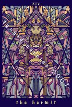
hey you! you din't tell me you were from the philippines! :D yeah i wanted coffee/chocolate colours for strength, and thankfully it shows. actually i dunno what to make of it in terms of artistic style, as it started with art nouveau but discorporated into a whole different look.

Chronata said:
hulglugglug,...

That would be the sound of me drooling all over my keyboard...

OMG! Lynard...these images are absolutely stunning!

Stunning...

I really love the art nouveau inspirations in them!
Of course I do!

All the little pieces...all the little lines, and forms and shapes, are just incredible...
but more than just the style...it's the MOOD that they invoke...richness, and warmth, with a hint of vintage Mucha posters, and Arts and Crafts style stained glass...and Northwest American totems...and... and...

Oh...if you decide to develop this style into a full deck...

what an amazing masterpiece you would have!

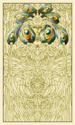
edited to add...oh...I really love the Masque card back as well! I think because it reminds me so much of the original designs you had for this deck (which I still adore, by the way...)
I don't think the two styles are really that disimilar...in fact they blend together so nicely.
I think because they both make feel the same way.

thank you so much. to hear that from a very inspired artist's extremely flattering. :) (actually, just wanted to share: your Minute exercise inspired me recently, and it was a wonderful experience. though i don't think i can work as fast as you do with colours, so i opted for just BnW) you got the inspiration correctly. the Arts and Crafts movement, especially with the priestess, though the other cards i think have evolved a style of their own. frankly, my worry's that the look would be too abstract to be appealing to people... but i'm really glad you like how it turned out. hopefully i can work with the two styles simultaneously, though that would mean extremely calloused hands. lol
 

truelighth

I love the new artwork as well. Does this mean you are going to work on the Masque Tarot again? That would be great. So far, I like all your decks and I would definately like to see this one to completion.
 

yaraluna

just read the first page of this thread. I like the deck so far.
do you have a WacomPen? is the best thing since ...hmmmm well since chocolate
:)

yara
 

blue_fusion

truelighth said:
I love the new artwork as well. Does this mean you are going to work on the Masque Tarot again? That would be great. So far, I like all your decks and I would definately like to see this one to completion.
thank you so much. yes, originally this was intended as a full 78-card deck (i think i even attempted adding an extra court card per suit before but scrapped the idea). i'm just hoping there'd still be a publisher interested as it's gonna be real expensive self-publishing it (78 cards per deck!).

yaraluna said:
just read the first page of this thread. I like the deck so far.
do you have a WacomPen? is the best thing since ...hmmmm well since chocolate
:)
yara
ah. well, actually, i've scrapped the pre-2007 designs for the deck as i couldn't anymore connect with the art style i used. 2 distinct styles are emerging from the studies i've been doing on the deck. as with wacom, i've tried it. takes a bit to get used to it. plus every time i use it, there's this nagging thought that i might break it, cuz i'm heavy-handed. but, i guess i'll have to get used to it, and keep up with the times.

anyway, here's the hermit card done in the "second" style. i figured i'd finish all the symmetrically-possible cards first, as it'd be less-demanding line art-wise, since i'd only have to do half the design. i dunno if i'll be sticking with the vintage colours, though. they seem appealing but somehow just a bit low in terms of energy.

i'm thinking i'd include some fixed shapes and images per card (here, for example, there's the six-pointed star, the actual face and hands of the hermit, and the lantern - which should look like an hourglass too), and just discorporate everything into broken panels and patterns. so that in a certain subliminal way, people would be encouraged to look out for other shapes forming in the chaos of shards and colours - which relate them to the reading. in that light, perhaps this deck will draw out more intuition from the reader.
 

Attachments

  • hermit_small.jpg
    hermit_small.jpg
    153.5 KB · Views: 149

blue_fusion

a sketch of the high priestess in the "older" style. not fully coloured, but you can see how different it is from the second style.
 

Attachments

  • testing.jpg
    testing.jpg
    125.9 KB · Views: 153

cirom

These are very nice images, well done.
You should consider printing them out on transparent acetate and use them as window decorations. I've done that with some of mine for personal use in my home, but your images would be even more appropriate. The effect can be quite stunning with the sunlight coming through. You could offer your prints for sale ????
 

Chronata

cirom has a great idea! I have used window cling film that fits in the printer to make clear prints as well! (then you can just stick themm up on any glass surface!)

The Hermit is so wonderful! I love all the shapes that emerge. I could look at these card samples for hours...this would be a perfect meditation deck.

Love the original style HP too...with all the tiny little "bits"
 

blue_fusion

cirom said:
These are very nice images, well done.
You should consider printing them out on transparent acetate and use them as window decorations. I've done that with some of mine for personal use in my home, but your images would be even more appropriate. The effect can be quite stunning with the sunlight coming through. You could offer your prints for sale ????

ohnoes! now i'm embarrassed that you saw the older images in this thread! thanks for the suggestion, though. actually the vector question i asked you is for this project. i haven't tried the acetate thing yet. i'm hoping there's printing service that does acetate-like material, only bigger than what's normally offered. i'd love to sell prints, but i have no idea how i could send them safely (from the philippines) to buyers :(

Chronata said:
cirom has a great idea! I have used window cling film that fits in the printer to make clear prints as well! (then you can just stick themm up on any glass surface!)

The Hermit is so wonderful! I love all the shapes that emerge. I could look at these card samples for hours...this would be a perfect meditation deck.

Love the original style HP too...with all the tiny little "bits"
thanks again. yes, actually the meditation angle's what i had in mind, especially for the more abstract second style. now... when are you going to get those masquerade minors finished! there are a lot of us waiting for a full-deck! :D
 

SaintOfScreams

I admire what I've seen greatly- I have always had a fascination about the many- faceted world of the Harlequinn.
 

Dee Ell

Was this deck ever finished? I can't seem to find any current info on it...?