I could VERY MUCH live without Jesus on the Lovers.
The cards you showed earlier were much more WS than a lot of these. I have to say I liked the ones you posted earlier better. The new ones are nice - but nowhere near as WS.
Yes, I do like the less "adventurous" ones better, too. Of course it's not my deck, but the first cards posted gave me the impression that this was going to be a distressed/aged/tarnished/discolored/recolored version of the RWS, and that the main changes would be colors and textures, not the actual images.
That said, I like some of the new ones, and even some things about the ones I don't like. I definitely
don't like Jesus in the Lovers, and the upper and lower halves of the Chariot just don't mesh at all.
One problem I see is that some of the art collaged into the cards and all the photographic faces are just too tridimensional to be there. Smith's art is quite flat, and intentionally so (I don't know much about her, but I have a feeling she was influenced by Chinese and Japanese art), and uses color sparingly and in the same 'flat' way, so those tridimensional faces and figures and those snatches of perspective (like in the Chariot) really clash. Perhaps they would need some 'flattening.'
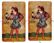
The Two of Cups is an example where the new heads work well; they look as if they were taken from medals or coins, and they definitely mesh. The Page of Pentacles seems to work, too, as well as St. Anne (is it St. Anne? I know it is Leonardo) in the 9 of Pentacles, although both faces are slightly out of proportion with their bodies.

") ) but bottichelli religious/church art is not something I like to see in my cards?!x,x so I would change that lady with child and jesus like gregory say!^^ lolz
) but bottichelli religious/church art is not something I like to see in my cards?!x,x so I would change that lady with child and jesus like gregory say!^^ lolz