Hadar TdM "Too Blue"

Barleywine

I read the JDM review of this deck here and learned that the cards seem a little "too blue" overall. I took a look at the on-line scans and agree that there is a certain "coolness" about them that I kind of like. For those of you that own it, do you find its "blueness" objectionable in person? It does seem different from more standard reproductions.
 

Yves Le Marseillais

Blue and blue

Hello Barleywine and all,

If you talk about the last version (the one with a telescopic box) yes it is really blue and it's too much for me.
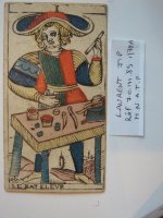
I do prefer an old deck such as Jean Pierre LAURENT deck who is a Tarot of Besancon Pattern deck and whom facsimile (printed in 1985 by French Museums) doesn't exist anymore.
Fortunatly I was lucky to get an exemplary on EBay for peanut few years ago and secundly I had in hand the real original deck in Paris (in a Museum MNATP).
This Laurent deck was the best blue colored deck I had ever seen.
I try to shows it here:


Best

Yves
 

Attachments

  • DSC03891.jpg
    DSC03891.jpg
    64.9 KB · Views: 148

Barleywine

Hello Barleywine and all,

If you talk about the last version (the one with a telescopic box) yes it is really blue and it's too much for me.
I do prefer an old deck such as Jean Pierre LAURENT deck who is a Tarot of Besancon Pattern deck and whom facsimile (printed in 1985 by French Museums) doesn't exist anymore.
Fortunatly I was lucky to get an exemplary on EBay for peanut few years ago and secundly I had in hand the real original deck in Paris (in a Museum MNATP).
This Laurent deck was the best blue colored deck I had ever seen.
I try to shows it here:


Best

Yves

I like the subtlety. The quality of the woodcut really stands out.
 

JDS

I am fond of the Hadar deck but agree that overall it is too heavy on the blue, and the Forneir Spanish TdM is too heavy on the green, but of the two I prefer the Hadar.

I also agree the J.P. Laurent Tarot de Besancon is a fine deck, one of my favorite reproduction decks, also a lot of blue but not as overbearing. Likewise I picked this up for next to nothing off ebay some time ago and was extremely pleased with the deck.
 

Abrac

If there's a new version I guess I haven't seen it, but the original version was a little "cool" though not too heavy, and the overall effect was very nice. I would say it leans a little toward the blue end, but it's not noticeable, in the first edition at least.
 

Wendywu

There's a second highly laminated edition out. I have the first edition and I too love the subtlety of the deck. I sold the second edition because it was like 78 very stiff, shiny credit cards :(. Nice box though - a two part sturdy box instead of the original tuck box.

I love the blues and coolness - suits me perfectly when I am in need of calm reason :)
 

shaveling

I got the Hadar when it came out. It's mostly languished in a drawer since then. But I didn't have any problems with the colors, blue or otherwise. And I still don't, though I prefer louder, less greyed shades myself. I sort of hated the intergalactic mutant flowers the deck took from the Dodal. Probably that wouldn't be such a problem for me today.

This thread prompted me to open my box of the newer edition, which I'd been saving as a backup or gift. One difference with the newer deck, not yet mentioned in this thread, is that the pips, twos through tens, have a Roman numeral at one end, indicating the top of the card. If someone is of the "the odd sword points down" persuasion, this might be an annoyance. It seems like a funny change to make. Kris Hadar had already designed the cards so that you could tell which end was up without having to mark the cards. That was encoded in which bits were red or blue, and which way the roses pointed on the coins and whether the swords were odd or even numbered. Knowing the system was fun, in an "I know the secret handshake" sort of a way.