Dark Victory '39
Sorry, 'suit' renaming, i meant. And yeah, the backs are truly awful. Might try to do something artsy w/ the backs.
I do have some criticism about the actual physical package, but the more I look at the deck, the more I love it. Despite some inconsequential shortfalls, it's well worth having, as it seems to me to be a highly personal expression of the archetypes and symbolism of tarot, while remaining a very usable deck. I love the courts and the minors: lots of insight has been channeled into these. Some won't like the renaming thing, but for me, it works. I already have lots of decks with the same old, so it's interesting to depart slightly from the norm, and the elemental correspondences remain the same. The Emperor is renamed War, which threw me at first, but it works. It's a less personal interpretation of this archetype, but adds a modern & universal dimension to the deck that feels appropriate in these times.
Japaridze's work is fabulous: she's a highly skilled artist with a masterful command of her materials. She's used acrylic, gouache, ink & collage, & the deck images are all quite varied but the whole thing holds together well in a recognizable style. I think it will be interesting to compare it to the Dali Universal, but IMHO the Japaridze reads way better.
The packaging is good: a gorgeous sturdy box & compact full-colour book. You couldn't say the book is extensive, but it does tell you a bit about the artist & how the deck came to be. Each card is reproduced as a full page in colour and is accompanied by a short interpretation linking the symbolism & meaning.
I'd have loved to see it include a scholarly essay about the artist, as well as something from Japaridze herself on her process of creating the paintings, and her thoughts on tarot in general. It seems to me that publishers miss the boat on things like this that would elevate the book to something special, rather than a run-of-the-mill repetition of things we've read elsewhere.
As for the cards themselves... The cardstock is sturdy but disappointing. I realize that US Games is going for volume sales and the affordable price is a plus, but I'd have loved to see it printed on a linen-type stock... something like the second edition VR with gilding would have been perfect. Don't get me wrong... it's not horrible by any means, but this gorgeous art deserved a better quality of stock. The lamination is just right though, with a very slight gloss that allows the cards to fan perfectly.
The printing is crisp and sharp, but my deck is printed a bit pale. Comparing the cards to the images in the book, it could be darker & have better contrast, which is really too bad considering how vibrant the paintings are.
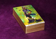
I hate the backs. Personal opinion for sure, but they could have done something more original than this blah ugly pseudo art deco infinity thing over a generic computer generated texture. It's entirely disconnected from the imagery of the deck.
The noncommittal white border treatment, thin black outline & grey title box choke the images, so I plan on trimming, gilding & discretely adding the titles in gold pen.
Publishers take note (experienced art director speaking here): mediocre graphic design interference really takes away from the beauty of the artist's hard work!!! What looks best on the computer screen doesn't always translate to reality in the same way. Borderless, with the titles at the bottom in a small black band would have been more discrete overall despite seeming like a bolder choice. And don't start telling me that you can't have full-bleed images due to technical specs, bleed requirements etc. That's a lazy cop-out: all you need to do is have a good photoshop tech add image if you don't have enough image. Or else you feel that you have to compensate because your printer is a lazy sob who can't be bothered to do a good print run.
It would have added to the exoticism to have kept the french titles too. I don't think it's necessary to dumb things down for the typical tarot consumer.
I'm really picky about creative direction & printing quality: I was in this business for a long time, so these things tend to bug me because I can see how this could have been a spectacular set. It is really a decent package though. The deck itself is truly original, challenging, inspiring and I can see it holding my interest for a long time to come.
") . Then for sure we would not get this awful boring non-inspirational lazy backs, no pale colors, better cardstock, smart borders / font decisions, etc.
. Then for sure we would not get this awful boring non-inspirational lazy backs, no pale colors, better cardstock, smart borders / font decisions, etc. Wintergreen, your posts really size up everything I would have said, and probably better than I would have said it! The reading you posted... wow! I don't need titles or words to feel that vibe, so I don't think renaming will bother me with this deck.
What a coincidence that you mentioned trimming and gilding the deck just as I was finishing doing just that today (see attachments). I found the not-so-handsome back pattern to be not-so-perfectly centered. If I had cut to center it, it would have taken a bit more off one side of the faces than I would have liked. I sort of compromised in my cut to center it a little more. Check out the left edge of your Aces relative to the backside to see what I mean.
...When I read about your ideas of borders and black title band, I was thinking I wish you (or people like you ) would work or be closely involved in production of these beautiful decks that get spoiled in post art-production.
The cards look so good! Must be quite a task to do it, though.