Oh! A Morgan-Greer discussion! Can I play? I hope I can help!
First, as to the shades of blue. Well, it would be "nice" to say that they started out dark blue (hint 1975) and faded over time, but by the time the MG decks were printed (1979) M&M had been messing around with blue card backs for almost 5 years. It all started in mid to late 1974 when they did the AQ decks for PGC. Those had a solid blue back. But the ink spread was costly and inconsistent, so they invented the swirly pattern in 1976.
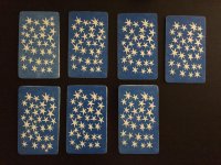
Zoom ahead to 1979 and all MG decks have 7 patterns of stars and various amounts of blue ink that "stuck" to the card backs. These decks ran for a few years. I do not think it is possible to tell the date of the cards by the hue of the blue, much as I would like . . . um . . "to."
(Sorry, that was unforgivable)
But, I may be able to help a little with some clues. If I may (ahem . . .)
The Encyclopedia PUBLISHED by Kaplan (with author credits) is correct, and so is Holly, but it is a blend of who is righter about what. The second series was most likely (80%+ probability) the black bordered cards. Here are some clues that should help. I am putting them in timeline form ONLY as a convenience, not as an iron clad fact:
By the way, if all of this is too confusing I am attaching images
")
Most likely "1st edition":
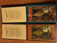
1) Brown boxes (and possibly Aqua) with NO STARS on the box and a simpler font. Borderless edition—horrible back print quality (this has been verified with another researcher). Large
stapled LWB printed in black ink. Price and address on back of box. (Note, this seems to be the only top-lift version with a price on it)
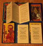
2) Brown AND Aqua boxes (this part has been verified) with stars and the new font. Black borders—much nicer card back print quality. Large LWB (12 panel) foldout, printed in brown ink. No price. Address on back.
3) Aqua boxes with stars and new font. Borderless—varying card back print quality; usually good. Small LWB (12 panel) foldout. No price. Address on back.
4) Blue boxes with stars and new font. Borderless—varying card back print quality; usually good. Small LWB (12 panel) foldout. No price. NO ADDRESS on back.
I hope this helps. I have had the good fortune to speak with the Morgans on several occasions; VERY nice people by the way, with fond memories of working in the print shop. The cost of the ink and the problems with the blue on the card backs was the main contributing factor to the problems of the stars and swirls and ink saturation. Unlike Rider (circa 1910-1939) they did not use ready-made card stock and so there was some issue with the "back" sides they printed on. Those are almost never as bright and clear as the faces of their decks, except in the Karin Koal days, and some of the early AQ decks (which is a different thread).
Also, I have had a running argument of Brown vs. Aqua vs. Blue box being the first. I believe the LWB is the final arbiter, and that staples were replaced by foldouts, which were replaced by smaller foldouts. The normal to decorative font and lack of box stars (above) lends credence to this theory.
Please feel free to correct anything above that is wrong.