
You are using an out of date browser. It may not display this or other websites correctly.
You should upgrade or use an alternative browser.
You should upgrade or use an alternative browser.
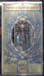
Pamela Colman Smith tarot, by Koenigsfurt-Urania Verlag?
rwcarter
Yes, that's the Lo Scarabeo Anniversary edition.
Cerulean
This edition copyright 2008 by Lo Scarabeo
LS color shift: whites as ivory; grays as khaki/green; blues tint green
It was hard to find the thread of this LS edition so many months later--May 2010. It took me that long until I could feel I could buy one and have time to look through it! I bought this from Alidastore.com in May 2010 via internet ordering.
The LS version that others have noted as "Centenary Special Edition" is not referred that way in any of the data I could find in the box. The two sides of the box say:
Pamela Colman Smith (R)
RWS(R) Tarot
and on the bottom:
Konisfurt-Urania
Verlag Gmbh
Made in Italy
with five flags
The inside booklet with a black and white scan of the Fool doesn't mention this as a special edition. Copyright is 2008, Lo Scarabeo in the LWB. The inside title cards say P.Colman Smith Tarot with a picture of the World and Rider Waite (R) Tarot with picture of the Two of Cups.
I was fortunate enough to be able to check and compare LS edition compared to the 1971 Samuel Weiser edition. This was one of the Accurate Color Tones editions of 1971 issued prior to unfortunate color shifts in various reprints. My Accurate Color Tones edition was printed in Switzerland by Muller & Cie for Samuel Weiser, Inc. in New York, NY in 1971. It comes "Complete with instructions Booklet by Arthur edward Waite and Forward by Stuart R. Kaplan." and it doesn't have:
copyright by U.S. Games on border of the deck
or computerized fonts.
Note, while the Accurate Color Tones instruction booklet has Samuel Weiser, Inc. with 734 Broadway, New York, NY 10003 address, there is one single instance of U.S. Games copyright--only on the instruction booklet.
This deck is more alike the Pamela A reproductions and descriptions by Frank Jensen's book "Story of the Waite Smith Tarot."
Anyway, after comparison, the variation of the color had me almost thinking the Lo Scarabeo was a Pam B or another version.
The Sun extra undulating line in the LS version is missing, more consistent with the Pam C or D from Frank Jensen's book.
The Roses and Lillies back could be a Pam A or C. The color of the backs are greener than the Urania/U.Sm Games edition.
The normal white horse of Death was more beige, the background of the Hermit is not an icy light gray, it's an olive green and the lovely blue-green night of the 8 of Cups has faded into a slightly darker olive. If Temperance's gown should have gray streaks, they are distinctly khaki in the LS version. It is subtle to some, so many might not care.
The linework is a Pam A as far as I could read and compare, but the colors shifted slightly more to a Pam B. Of course if you compare it to the very greenish-mustard-yellow-beige Original Rider edition by U.S. Games, the LS colors seem truer to a Pam A. But compared to other lighter and clean editions done previously by AG Mueller, U.S. Games, or Samuel Weiser...I did see color distinctions.
These small things aside, I do think well of the LS's printing. There's most of Pamela's line work, the nice 1909 design of the backs, a lack of copyright notice on the front. The LS edition bigger changes include -
-Size.
LS size being about 3/8 thinner and 1/8 inch shorter
-Slippery lamination
-Delicate yet durable thinness of the card stock.
-Color shift explained above
-Computerized fonts on top of every card, not only majors, but all minors (courts and suited cards) and computerized titles on the bottom.
Overall, I think the LS work makes this a nice edition, a really good working copy if you do not mind changes in color, line art and typograpraphy from older editions. But if you get a previous edition of the Rider Waite deck or a Giant Rider Waite with original calligraphed titles, finding there is a color shift and the feel of the different titles might be puzzling. Those who are used to a more old-fashioned Rider Waite may have been used to not having titles in the suited cards or only seeing the English titles.
The LS even with different tints and shades might sadly be the best and most affordable Pam-A linework edition available--somewhat sadly for some U.S. fans who have to search a bit to get the cards imported at a bit of a cost. I've only found the Sun rays changes so far in trying to do a historical art comparison, haven't really worked with the deck right now.
It was wonderful of the 78th Fool and others to make notes and scans of this deck in the linked review below.
http://www.aeclectic.net/tarot/cards/rider-waite-scarabeo/
Previous posts to this thread also linked to the earlier discussion. The forum helped me to wait until I thought it was reasonable for me to buy a copy.
Yes, I do like the deck and consider the LS version a very nice edition, with differences noted for those preferring certain details in their version of the "Rider-Waite-Smith".
If I had a choice, I would choose my older Switzerland 1971 Samuel Weiser deck for art comparison...wish I could get this edition more easily for the $7.50 I paid a few years ago. Because I cannot get the older edition easily any more, I could use the LS full size version and if I had to recommend a modern one with PCS's art, it's a good one to have!
But you might have to make notes somewhere about the LS edition differences if you are using Frank Jensen's book as the reference and need to refer to an actual deck example for an art history class or documentation purposes. If your teacher was an art tarot fan, the modernization differences can add up to something that varies with past standard references.
Sacred Tarots free line art samples of the RWS might be a better reference
Best,
Cerulean
P.S. I hope the notes are helpful. I might suggest for a LS 2012 edition to note the Samuel Weiser 1971 might be a good example of a really nice Accurate Color Tones edition for art history!
