The Queen of Cups' Cup

HoneyBea

Berbatov said:
It seems fairly clear here;
http://www.sacred-texts.com/tarot/pkt/img/cuqu.jpg

Holley Voley says this is from a 1909 deck, but who knows what colour it was when PCS painted it.


Berb


I see it on yours, not on mine though, maybe its a fault of the printing - thanks for that, I will try to remember that it is red :)

If it is a ruby I have read that rubies are the gem of royalty and are considered good luck and a symbol of power.
 

Queen of Disks

To me, the cup has always looked like a little robot. ("Danger, Danger, Will Robinson!") :laugh: 
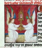
The two angels remind me of the descriptions and popular ideas of the Ark of the Covenant (I'm assuming we have all seen Raiders of the Lost Ark.) I don't see any jewels on the Original RWS or the Albano-Waite.
 

Jourdain

Honeybea, I think we're using the same deck. Does yours have the blue tudor-rose background? If so, we're using a version published by Rider & Sons (called the ORIGINAL Rider-Waite)that's SUPPOSED to be a facsimile of the original printing--which it isn't (exactly). I prefer the colors of our deck, as they're not as jumpy, but in our deck that red stone is missing (as are a lot of detail colors). The Giant Rider-Waite deck is a blown up version of the more commonly available deck by U.S. Games--sans PCS's calligraphy at the bottom and replaced with a grey box and typed characters.

Hope this helps!

(Oh, and QueenofDiscs, I totally agree! It DOES look like a little robot!)
 

HoneyBea

Jourdain said:
Honeybea, I think we're using the same deck. Does yours have the blue tudor-rose background? If so, we're using a version published by Rider & Sons (called the ORIGINAL Rider-Waite)that's SUPPOSED to be a facsimile of the original printing--which it isn't (exactly). I prefer the colors of our deck, as they're not as jumpy, but in our deck that red stone is missing (as are a lot of detail colors). The Giant Rider-Waite deck is a blown up version of the more commonly available deck by U.S. Games--sans PCS's calligraphy at the bottom and replaced with a grey box and typed characters.

Hope this helps!

(Oh, and QueenofDiscs, I totally agree! It DOES look like a little robot!)

Yes we are using the same deck - but I thought it was the nearest to what Pamela Smith did - am I wrong then? Because if it is the nearest to Pixies original printing, then this deck would be nearest to what Waite was talking about.
 

Jourdain

You know, Honeybea, I've seen a deck from a printing in the late Teens, and it's actually sort of a hybrid of the two decks currently available. I think ours is the more correctly tinted (as far as the saturation of the colors) and printed (the calligraphy), and that the other deck is more correct with the actual colors themselves. I like ours better, though, it has more of Pixie's charm to it, I think, with her calligraphy, and I greatly prefer the muted browns of our deck to the greys of the other.

And as far as Waite goes, sometimes I just have know idea what he's talking about anyway, so it's all good, hahahaha.
 

Berbatov

HoneyBea said:
Yes we are using the same deck - but I thought it was the nearest to what Pamela Smith did - am I wrong then? Because if it is the nearest to Pixies original printing, then this deck would be nearest to what Waite was talking about.
PCS does complain that she has doubts regarding the abilities of the printers to faithfully reproduce her pictures.

We will never know which deck is the most accurate reproduction, unless someone finds the original plates or pictures.

I was looking at some of the Queens in other decks at trionfi.com and a large number of them had something red, either a jewel of band, at the centre of the cup. Perhaps this where the idea came from. The Queen in the Sola Busca deck is also worth looking at, both for the ornate cup she is holding, and her attitude towards the cup.
http://trionfi.com/0/j/d/solabusca/index.html


Berb
 

Teheuti

It's called a ciborium - used in the Catholic Mass to hold the host during communion.

http://www.newadvent.org/cathen/03767a.htm

Sometimes a ciborium is shaped more like a tower. See attachment for one held by two angels.

The angels holding the Queen's cup are also like those described on the Arc of the Covenant.

It seems to me like a symbol of protection of something valuable and holy that should not be profaned.

Mary
 

Attachments

  • ciboriumAngels.jpg
    ciboriumAngels.jpg
    126.4 KB · Views: 152

Teheuti

Berbatov said:
We will never know which deck is the most accurate reproduction, unless someone finds the original plates or pictures.
Coloring aside we can see which deck most closely follows the b&w line drawings in Waite's Pictorial Key and in the article he wrote when the deck was first published. I think you'll find that the lines of the "Original Waite" do not follow the early line-drawings very precisely, but rather are clunky by comparison.
 

Jourdain

I like the clunkier lines better. Also, there's printing errors present in the original deck that are present in the Original but not in the deck, etc), which leads me to think that each deck follows the original not as a whole, but mostly on a card by card basis. It's sort of a trivial issue, really, but whatever.

Also, I used to be Catholic, before converting to Judaism, and the cup certainly does resemble a ciborium.
 

DoctorArcanus

Berbatov said:
I was looking at some of the Queens in other decks at trionfi.com and a large number of them had something red, either a jewel of band, at the centre of the cup. Perhaps this where the idea came from. The Queen in the Sola Busca deck is also worth looking at, both for the ornate cup she is holding, and her attitude towards the cup.

A most interesting feature of that Sola Busca card is the snake coming out of the cup (see this image of the original in color). I think this detail has been discussed years ago in some other thread.

Marco

PS: here you can find some information on the Homeric character of Polyxena.