Trends in Tarot Deck Art

G6

Hellow Folks,

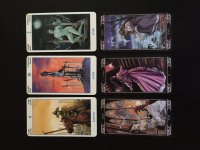
I was looking at two of my Lo Scarabeo decks (Secret Tarot and Ludy Lescot) and thought about the differences in color and card stock quality.

Secret Tarot came out in 1998 and the attached image is from a 1st Edition.

Ludy Lescot came out in 2011 and the attached image is a copy I just purchased.

Obviously the card stock is much thicker/better on the older Secret tarot, but what was interesting to me is that these are both "dark" decks, however the Secret Tarot has much richer/saturated colors and the Ludy Lescot has a mostly muted palette. I picked out the 3 cards with the most saturated color from the Ludy Lescot for comparison.

I'm wondering if this is the cell phone photo filter phenomenon we are witnessing with the preponderance of decks that have a cast that is muted or faded or antiqued?

I much prefer a rich use of color (like in the Secret Tarot) and the feeling or mood to come out through the color relationships and not a dumbed down filter effect (like in Ludy Lescot).

Thoughts? Have you noticed this or any other trends in tarot deck art? What is your preference?
 

Attachments

  • Secret:LudyLescot.jpg
    Secret:LudyLescot.jpg
    98.8 KB · Views: 147

gregory

I think it is much more a matter of the artist who works on the deck. I don't think you can generalise at all based on two, really.

I actually own almost every deck Lo Scarabeo has ever put out, and I don't think the card stock has deteriorated at all. The only sort of "global change" has been their response to complaints about multilingual titles - they rarely have them any more, using symbols instead.
 

delinfrey

Something that I have noticed is that digital art decks seem to look really good on a screen, but not that good in real life; whereas hand-drawn decks might not always look the best on the screen, but can be stunning in real life. Makes you think whether modern tarot artists rely more on what looks good on the screen for marketing purposes?
 

Barleywine

I haven't seen a noticable trend. My most recent LoS deck is another "dark" one: the Night Sun. The colors seem quite rich overall. On the other hand, the Haindl Tarot - a USG publication - has always seemed rather dreary-looking to me. As gregory noted, its probably due to the artist and not the printing.
 

G6

I think it is much more a matter of the artist who works on the deck. I don't think you can generalise at all based on two, really.

I actually own almost every deck Lo Scarabeo has ever put out, and I don't think the card stock has deteriorated at all. The only sort of "global change" has been their response to complaints about multilingual titles - they rarely have them any more, using symbols instead.

Yes, not just on two or LoScar only. The filter factor seems present in many current decks. The card stock is way thinner/less substantial on the Ludy Lescot vs. the vintage Secret in my opinion.
 

Barleywine

Yes, not just on two or LoScar only. The filter factor seems present in many current decks. The card stock is way thinner/less substantial on the Ludy Lescot vs. the vintage Secret in my opinion.

I can agree that card stock isn't what it once was overall. (Anything to shave a few pennies off production costs; I blame it on all the MBAs hired for just that purpose - OK, I'm half-joking there.) But then we get something that defies the trend, like the Illuminati, which has card stock like styrofoam beer coasters.
 

G6

I can agree that card stock isn't what it once was overall. (Anything to shave a few pennies off production costs; I blame it on all the MBAs hired for just that purpose - OK, I'm half-joking there.) But then we get something that defies the trend, like the Illuminati, which has card stock like styrofoam beer coasters.

That's good to know about the Illuminati although I don't plan to get that one. The same is true for the Zombie Tarot. Zombie is coaster thick. I was more looking at LoScar and Llewellyn. The two here vintage Secret vs. Ludy Lescot and also my vintage Morgan Greer vs. the recent MG pocket/tin version. Big difference.
 

gregory

Actually I find Lo Scarabeo stock holds up better than thick ones from Schiffer etc. They are whippier than they used to be; I think it is a matter of different stock being available rather than saving money ! - but I have never had a card crease on me, scratch, or fray at the edges - and I have had with many other publishers. Llewellyn crease; Schiffer fray....