Tao Oracle
I've seen images of this deck for years, and for a long time I was put off by two things: the notoriety of the Osho Rajneesh group in Oregon, and the HUGE borders on the cards.
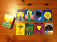
I felt the same about the Osho Zen Tarot, but I read so much good about them that I bought the deck. My research then made me feel more comfortable that Osho himself apparently didn't do all the reckless things, but it was the woman he gave so much power to. The tarot deck is only a collector's piece, IMHO. Although it's attractive, it's too far off from the RWS standard that I prefer.
So my good experience with the Osho Zen convinced me to buy the Tao Oracle. It's my sixth I Ching deck, but the art work matches the hexagram meanings better than the Holitzka paintings do.
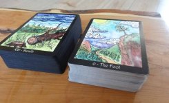
I still hate the big borders, and the cards themselves are 5" tall, too big to handle comfortably.
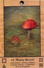
I don't understand why Padma felt the need to give three versions of the trigrams. The actual hexagram in the lower right corner is visibly divided into its upper and lower trigrams, and I didn't find it hard to learn their eight names. But Padma gives completely new symbols for the trigrams in the lower left corner. To me they look like ESP card images, and they're redundant. I do have a Chinese I Ching deck that does the same thing with its own 8 symbols, and I thought it was redundant on those too.
BUT, as if that wasn't enough duplication, Padma has assigned eight colors to the trigrams and they appear in the top border in a yin-yang symbol. That little circle is ALL that occupies that big border. Besides, I don't deal much with the trigrams, which are a later tradition.
So I spent a couple of hours playing with the digital images and "cropped" off what I didn't need. I printed these new images on Avery 5390 Name Badge Inserts, with a narrow version of the card backs. These are a quarter of an inch wider than business cards. Now I have a deck that is more flexible and fits my hands, and that gives me only the information that I need.

")