The kit is at Barnes and Noble, Sept 2008--gilded & different
The first glance is pleasure itself. The gilding shown on the card samples on the package front is on all the cards. All the gold is sealed within the plastic coating. There is nothing to scrape off or scratch.
Production comments:
If you do not like plastic cards, you'll skip this deck. But I like it.
I did not smell anything in terms of the laminate or ink on the cards after ripping off the plastic. This was on a warm night. I do know there is a slight 'new book/deck' smell, but it was not overwhelming.
One of my friends who is much better at assessing details in card decks looked at my new Liz Dean-M. Lanay (Golden Tarot) deck-- the scrutiny was to see if the card pictures were centered, if the backs were centered, etc...so I did the same to my Truth-Seeker's Tarot. My first edition is looks very very nicely printed in that way.
The shape of the card corner cuts are slightly rounded, not sharp. I can tell you they are not exactly aligned. But I will not be cut by burrs or bothered by printer marks. The plastic laminate is very smooth. I don't have any slippery card "waterfall" when I stack the deck--I hope you guys know what I mean!
Majors
I saw elements of design and order that echo colors and patterns of Rider Waite, Oswald Wirth and Marseilles-Milanese patterns.
I like David Fontana's various other books on symbols, dreams, and his way of categorizing many different cultural symbologies. He has a modern take on interpreting the 'psychological and self-insight' approach to reading tarot.
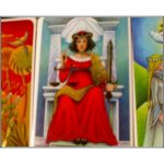
For example, if he discusses colors and numerology, he will summarize his take of 'red' as power/authority. My example will be Justice (as 11). She wears the red robe of 'worldly power' in this tarot. Words such as enlightenment and balance are used in a positive way are pointed at as goals or higher thoughts around the symbology.
He suggests the Grecian metaphor of Themis and points out the highlights--scales for weighing good and bad deeds; sword for both guarding entry to Eden and cutting through ignorance. Her wearing the robe of worldly power needs to be balanced by insight. Next comes a suggestion to consider how your inner judgment is being used.
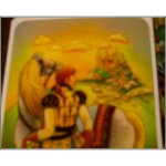
The human figures in Sun, Star, Lovers and the Devil cards are bare. David Fontana discusses the design choices, which I really think were done under his direction. (see below*)
The gilding highlights are on her headdress, sword, shawl and scales and the footrest where we see the tip of her shoes. Unlike Marseilles/Milanese decks, she isn't in sandals or barefooted. She's seated on an upraised stone chair that has columns/pillars and a small white curtain is behind her head. When I look at the card closely, I can see shading or gradation in the coloring--as if it was done wih colored pencils on a slightly matte board. The gilding enriches the detail, but doesn't overwhelm the soft colors in the design.
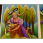
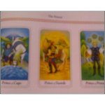
Minors - Pips with scenes and patterns, no humans
*David Fontana's books have been illustrated by many different artists commissioned by his publisher Duncan Baird. The deck design team here lists a managing designer of Suzanne Tuhrim first after two other editors and 'commissioned artwork' by Sylvia Daigmeault is listed last...so my guess is this design was done under Fontana's written directions.
I grabbed my most concise book by him called "Teach Yourself to Dream: A Practical Guide" published in 1997 (reprinted by Chronicle Books--Duncan Baird is the original publisher). His take on numerology from numbers 1-9 and his notes on color is scattered throughout the book. He suggests guidelines for interpreting numbers and color based on his take of different sources and cultural ideas.
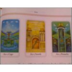
At first I was a little disappointed that the pips lacked humans. Some of the backgrounds are also repeated. However if I read the book, the summary of all the Aces, twos, threes to ten and the small pictures show that this deck was designed with a progression of numerology in mind.
The book is designed well. Page 40-41 discusses the structure of the minors and assignment of color and elements in this tarot. His assignment of yellow to the swords and red to the wands might be typical of those who believe yellow would be air and red to be fire...but in reading closely throughout the pip cards... he assigns wands to air, even though some of the pictures of the wands look distinctly fiery. I'd be able to ignore the book on this point and go by pictorial thought to assign fire in my thoughts to the wands if I like.
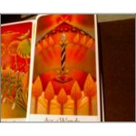
When I open up to the discussion of the Aces, pages 42-43, I can see all four Aces in color and the summary of all the aces are discussed on these pages.
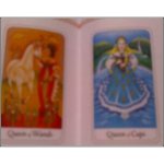
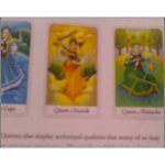
Courts
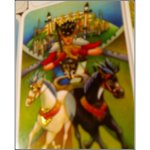
Well, he took a design page similar to decks that I've seen that follow Robert Wang's ideas of Princesses/Princes/Queens and Kings. The Princesses include young nymphlike representations of their elements--for example the Wands Princess will be a bare-chested Amazon or "Xena, Warrior Princess".
That's my first take on the deck so far. Subtle, geared toward insight and thoughts. He lists in his recommended reading some very nice modern authors--Mary Greer and Tom Tadfor Little for Understanding the Tarot Court, Robert Place for his Tarot History Symbolism and Divination, Sally Nichols for Jung and the Tarot, Gareth Knight for his Magical World of the Tarot/Fourfold Mirror of the Universe, Stuart Kaplan's four encyclopedias and Karen Hamaker Zondag for Tarot as a Way of Life
The packaging is very sturdy--a very nice kit. Fontana's notes listed in tiny font on the credits page says tarot is geared toward self-development and gaining insight rather than prophesy or instructing on present or future actions. I would say this is a deck that helps calm and direct ones' thoughts and would be a good complement to his various other titles on signs/symbols/dreams...his new edition of his symbols book comes out later in 2008.
Cerulean