Lo Scarabeo's RWS Tarot/Centenary Special

rwcarter

I actually kind of like this one! It's striving to be a different clone this time around rather than a cleanup of the original, and I think it works. I definitely agree that it invokes Robert Place's line art, but rougher, thicker.
I agree on that count.

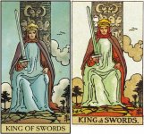
BUT the deck contains Pamela Colman-Smith's name on the box and it's not her art! It's a completely different deck now and therefore needs to have a different name. I honestly can't believe that anyone at LoS thought it was a good idea to change the art but not the title of the deck.... The name evokes certain art and what's in the box is not that. So why piss off those buyers who are looking for one thing but get another? That's called bait and switch here in the States and is illegal.

Rodney
 

Emily

I always thought AT had a fairly good relationship with Lo Scarabeo - We buy enough of their decks. But this deck has come out of nowhere, Similar box, same name but a completely different deck.

So now they have two completely different decks using the same name and a nearly exact box. It makes no difference that the first deck has been discontinued, anyone reading posts on here about the first deck, unless they do their homework, will think they are getting a vintage looking Rider Waite, even on here if you search it out you will get the first, multi-language version. But instead they will get this new deck, at the moment it appears to be only available from the Lo Scarabeo website but sooner or later it will be available from other sellers.

Lo Scarabeo discontinue decks all the time, they should have brought this new clone deck out with a different name.
 

Chrystella

This is the deck I trimmed. It's very nice save for those borders. In the new edition, I like what they've done with the colours, the backs, and I'm glad the multi-lingual titles are gone. I won't be rushing out to to pick this up though. I don't like the lines and I agree that the King of Cups has a strange face. I'd like to see more cards because these two seem very different stylistically, as if the Magician and the King of Cups belong to two different decks.
 

truelighth

Ugh! What a disappointment, this new version. The line art is obviously different, so it I has been redrawn. Or perhaps they used the line art of a B or C deck. And the colours are nothing like the original Pam decks.

The least they should have done is rename this deck. Now it gives the impression you get the old Centennial, when you actually are getting this newly produced and very different RWS. Nope, do not like.
 

Terrapin

[Quote: The line art is obviously different, so it I has been redrawn. Or perhaps they used the line art of a B or C deck.]

I believe you are correct, truelighth. I think it's the same line drawings we see in the 'Original' Rider Waite deck published by US Games a few years ago, you know, the one with the mustardy yellows and strange (but lovely IMO) greens, with no blues at all. The Magician's face is blurred in that one too and the King of Cups has the same strange face--cross-eyed or something. I think it's a Pam C. If this is correct, then it is a historical deck that's been updated with new coloring, but I agree with everyone who has said it's kind of bad PR and marketing on LoS part. I'd still be interested in seeing more of the deck to compare it to the Original RW deck though.
 

agviz

truelighth and Terrapin - when you're right, you're right. And you're right. At first I thought, no way, but upon pulling out my US Games Original Rider Waite, I see there's an exact resemblance just as you described it. See the comparison below (RWS Tarot on left, Original Rider Waite on right, for both). That really threw me! Well, I guess there's some merit to LoS's intent here.
 

Attachments

  • RWS Tarot and Original.jpg
    RWS Tarot and Original.jpg
    110.9 KB · Views: 285

Aeric

truelighth and Terrapin - when you're right, you're right. And you're right. At first I though, no way, but upon pulling out my US Games Original Rider Waite, I see there's an exact resemblance just as you described it. See the comparison below (RWS Tarot on left, Original Rider Waite on right, for both). That really threw me! Well, I guess there's some merit to LoS's intent here.
Yup it's definitely Pam-C Original RW with the Sun's crooked smile and the KS' despondent face.

That must be why I like the re-colouring; I hate the Original's muddy overcast tones.
 

Attachments

  • kingsw.jpg
    kingsw.jpg
    139 KB · Views: 262
  • sun.jpg
    sun.jpg
    187.9 KB · Views: 257

Le Fanu

I love the Original RWS - never tire of it - even with all the praise of the U.S games PCS Commemorative deck. Old printings of the RWS do sometimes have that blotchiness in certain editions but people tend to want high resolution, seen as somehow more authentic.

As I love the Original, that must be why I quite like this one. I thought I recognised that lizardy look of the King of Cups, as though he has just spotted a fly on a water-reed and is about to shoot out his tongue.

The marketing gaff is an issue yes, but I still MUCH prefer this to the Radiant, the epitome of bad recolouring.

ETA; but that little squiggle in the Sun has gone...
 

magicjack

And there is no U.S. Games Systems stamped on every card.
 

Abrac

No one can seem to get it right. :laugh:

I like that they removed the multilingual titles but now the color's out of whack and the title font is still modernized. The backs don't seem too shabby. Hmm, maybe if they put it in a tin. . . ;)

Sigh, still waiting for a true reproduction.