Lo Scarabeo's RWS Tarot/Centenary Special

agviz

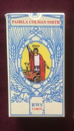
This version of the RWS had some excellent line and color, but was recently changed to an entirely different deck. The new version loses the multi-lingual text, has more shading to the color, and much of the line drawing is thick and sloppy. And there are new backs. The box is similar but swaps out artwork from the new cards.

In my opinion, this new deck is far inferior to the previous version because of the sloppy drawing style. And it's so different from the previous version that I wonder why it was swapped out rather than offered as a separate deck. Is this by chance a copyright issue as it relates to US Games?

I learned of this change by ordering the deck directly from Lo Scarabeo, which at the time showed images of the previous version on their site. Man was I surprised when the deck arrived. Shortly afterwards, Lo Scarabeo updated the page with images of the new deck. I'm currently in the process of trying to return the deck, but haven't heard back from LoS after a few tries. Maybe it takes a few knocks on their door.

For reference, here's the original version on Aeclectic. Here's the new version. Look at the line element on the Magician. And what's with the goofy look on the King of Cups' face?

And so I ask, what's going on here?
 

Le Fanu

And here is a picture of the original box. Fortunately, buyers need not fear purchasing it by mistake as the versions can be distinguished by the boxes.

This box is the original and best. Look closely at the backgrounds of the Magicians. The newer version has a more orangey background.
 

Attachments

  • LoS.PCS.Tarot.2 - Copy.jpg
    LoS.PCS.Tarot.2 - Copy.jpg
    63.3 KB · Views: 797

agviz

Thanks Le Fanu. Any suggestions where to find the original online? I'm figuring it's no longer available through LoS.
 

Babalon Jones

Fascinating. Seriously surely there is a story and reason.

Semi related it makes me wonder how many straight up redrawings/colorings exist that call themselves a rendition of the original vs how many real editions of the original art exists.

Probably some expert on here could take an educated guess even if no one knows exactly!
 

Le Fanu

Thanks Le Fanu. Any suggestions where to find the original online? I'm figuring it's no longer available through LoS.
I've been searching and it really has disappeared. You used to see it on ebay - it was also at alidastore - but nothing comes up in a search. A search for Pamela Colman Smith brings up only the U.S Games version.

I love that edition - the original LoS one. Partly the size, but also the backs and the colouring. I really can overlook the multi-lingual titles on this one. I can understand your disappointment at what you received. To be honest, I (personally) don't mind it that much. I prefer it to the Radiant Rider Waite. That 3 of Wands has something of Robert Place's art. The lines are bold and the colours are muted. But obviously when you're expecting something else, it's not nice.

I'd love to know the story behind this change. But I think I can guess...
 

Emily

I'm really disappointed that they have changed this deck. I loved the look of the Original Lo Scarabeo PCS, beautiful detail, lovely muted colours - this new version looks messy, there seems to be no fine details and the colours are horrible. In my eyes, this deck is now just another re-coloured clone deck.

I've also had to go back and add edits to my postings mentioning the original version because I've song its praises and recommended it in quite a few posts - I wouldn't want to mislead others into thinking that I'm recommending this clone deck. There are far better re-coloured versions out there. And there is no way that you could compare this to the Centennial deck.
 

Aeric

I actually kind of like this one! It's striving to be a different clone this time around rather than a cleanup of the original, and I think it works. I definitely agree that it invokes Robert Place's line art, but rougher, thicker.

The use of warm and cool gradients is always an improvement over the basic Rider's flat, lifeless colours in my book. I'll always despise the flatness, and this one gives it tone and dimension.

I REALLY, REALLY hate the font used in the contemporary RWS, that ugly thick black font on sterile grey. But here, the wider, thinner font on beige almost looks like engraving. I'm SO happy they did away with multilingual titles that crowded the top.

Lastly, that's a lovely Rose back that spins the original nicely. Llewlyn's Classic tried to reinvent it and makes it look like cottage wallpaper, but this is great. The natural colours of the flowers restored, and no blue, makes it feel like springtime.

I swore I'd never buy another clone, but I just might get this one.
 

Le Fanu

Can you feel the groundswell of impending love for this newer version of the deck?

Obviously (for agviz) the initial reaction is coloured by the disppointment of expecting to receive something else. But I do much prefer it to the fake tan Radiant. The original edition of the LoS PCS deck I like as a RWS deck, but this one is doing something different.

I shall buy it and see close up what it looks like before I fully commit myself!
 

agviz

Well hey, it's good that it's liked. My guess - based on the reactions on this and another thread - is that it will have both its share of supporters and detractors. Nice to see a range of responses.
 

rwcarter

Moderator Note

A couple of posts have been removed from this thread as they concerned a trade. The proper forum for such posts is Tarot Trading.