Ciro Marchetti Marseille-Inspired Deck

DownUnderNZer

So, I opened the deck up last night....

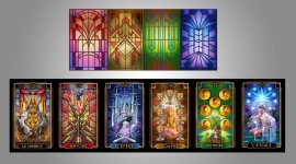
I do like a lot of the cards, but not quite all. Also, I think what is online seems more "vibrant" and "detailed" perhaps in comparison although the size of this deck is indeed an improvement on ones like the "Legacy of the Divine".

I think MOST of the MAJORS are exquisite and I do like the DEVIL and LOVERS. 9 of Cups is really cool too. (I have yet to go through them properly though).

DEATH would have to be one of my least favorites only as the colors are so somber and it took me a little while to work out which card it was in the deck.

Still making my mind up about the card stock and so forth.


DND :)
 

cirom

Glad that you like most of the cards. The Death card without a title is a Marseilles tradition in many decks, (he who can't be named) although it does have a number and thus an indication of order/position within the deck, along with its skull, coffins etc.....

BTW you may have noticed that the Fool does not have a number, not even a 0, that is also a common Marseilles tradition rather than an oversight.

The printed colors are in fact very accurate and faithful to how they appear on screen, (my screen) which for obvious reasons is deliberately calibrated to simulate an "average" standard. However the issue is that most people may have screens that because of their brand, might display colors slightly warmer, or cooler, and of course their own optional settings of brightness, contrast etc... All would cause potential variation when comparing either from one screen to another and certainly screen to print.

Regarding the size.. most of my special edition decks are approximately this size, including the original Legacy of the Divine, its the standard editions, released by the publisher at later dates that were smaller. Its likely that when this deck is also released as a standard edition (around 2018) that it will also be smaller.
 

gregory

Is there ANYONE who likes EVERY card in ANY deck ????

I don't know anyone. Though now I shall have to get this one out to see which card to pick on as not quite the thing for me.

But this one has done rather well on being in the Tradition without being slavish. I THINK all the "words" are spot on - including those that aren't there.... (as in where DOES the Fool sit among the other cards ?0, 22, or even as with some non-TdM decks 21, which is a bit of a stretch for me !)
 

DownUnderNZer

The deck is truly perfection when it comes to the artwork. Majors and Minors alike!.:thumbsup: :thumbsup: :thumbsup:

The time, effort, and hours it would have taken to complete it. True craftsmanship. :heart:

Did notice "Le Mat" with no number only as I have the deck out now. :D

The brown gown of the HERMIT is not something I like, but I do understand that not everything can be blue, green, yellow, red, orange, purple, indigo, azure, and so forth.

So, it just comes down to me and the fact I do not like anything that is not so vibrant.

Having a proper look through it now I do appreciate the work that went in to it and am not disappointed. The artwork is well worth it!

DND :)

Glad that you like most of the cards. The Death card without a title is a Marseilles tradition in many decks, (he who can't be named) although it does have a number and thus an indication of order/position within the deck, along with its skull, coffins etc.....

BTW you may have noticed that the Fool does not have a number, not even a 0, that is also a common Marseilles tradition rather than an oversight.

The printed colors are in fact very accurate and faithful to how they appear on screen, (my screen) which for obvious reasons is deliberately calibrated to simulate an "average" standard. However the issue is that most people may have screens that because of their brand, might display colors slightly warmer, or cooler, and of course their own optional settings of brightness, contrast etc... All would cause potential variation when comparing either from one screen to another and certainly screen to print.

Regarding the size.. most of my special edition decks are approximately this size, including the original Legacy of the Divine, its the standard editions, released by the publisher at later dates that were smaller. Its likely that when this deck is also released as a standard edition (around 2018) that it will also be smaller.
 

cirom

The background stained glass windows of my Tarot Decoratif deck are more than just colorful decoration, they serve as a common visual theme that binds the deck together. They are my adaptions based on the designs of Frank Lloyd Wright and Charles Rennie Mackintosh, both principal artists of the Art Deco movement
They vary slightly in color tone from card to card while having an overall commonality within each suit. However the actual patterns are repeated in such a way as to connect corresponding and associated cards. So for example cards II, XII, and the twos of each suite will share a similar pattern, as would VII, XVII and the sevens etc etc.
 

gregory

Here's the image that needs to go with that post: as Cirom isn't a subscriber, I said I'd post it.

Now I will go and get out my deck to look at the patterns....
 

Attachments

  • background.jpg
    background.jpg
    106 KB · Views: 129

Annabelle

How wonderful to see the background stained glass images on their own! If only I had those windows in my home :).

Ciro, thanks for sharing the information about the background images repeating/connecting across cards; I hadn't noticed it before, but now I'm eager to have a closer look at the deck tonight :).
 

Luna's Crone

maybe its just me Ciro, but i like the deck :) and those pix that gregory put up of the backgrounds are just beautiful. At first i was taken aback by no shine etc. but then i thought the cards weren't like that back then. this deck is spot on.

also, why not join the group, and be special like the rest of us.

i can't tell you how to define special, tho
 

cirom

How wonderful to see the background stained glass images on their own! If only I had those windows in my home :).

Actually I'm working on the next best thing for my house. I'm having a couple of the card images enlarged and printed out on a translucent film (the same material used for illuminated advertising displays) and then sticking them on a window that receives the the afternoon sun.
 

gregory

Actually I'm working on the next best thing for my house. I'm having a couple of the card images enlarged and printed out on a translucent film (the same material used for illuminated advertising displays) and then sticking them on a window that receives the the afternoon sun.
You could SELL those. If I had big windows I'd buy some...